Reimagining Cacoo: How do we build for customers?
“How do we build for customers?” is a deceptively complex question. It often leads to other questions like, “What should we build?”, “Who are we building for?”, and “How do we know if what we’re building is right?”
For Nulab, figuring out how to build for Cacoo customers was not just about improving a product but about developing a new product development philosophy while becoming a more user-experience (UX) focused organization.
How did we get there?
Up until the beginning of 2017, Nulab was an organization focused on software developers, the ubiquitous builders of tech. All of Nulab’s products were originally created by developers, for developers.
Since then, Nulab’s customer base has grown. Its products now serve customers in every industry, worldwide. Nulab itself has a dedicated UX team and many budding UXers (e.g. those in other job roles that are learning about UX) who are all working towards creating a better experience through UX philosophies.
Supporting its UXers, new UX focused processes and infrastructure were implemented, including:
A usability testing station

User testing processes and participant recruitment operations


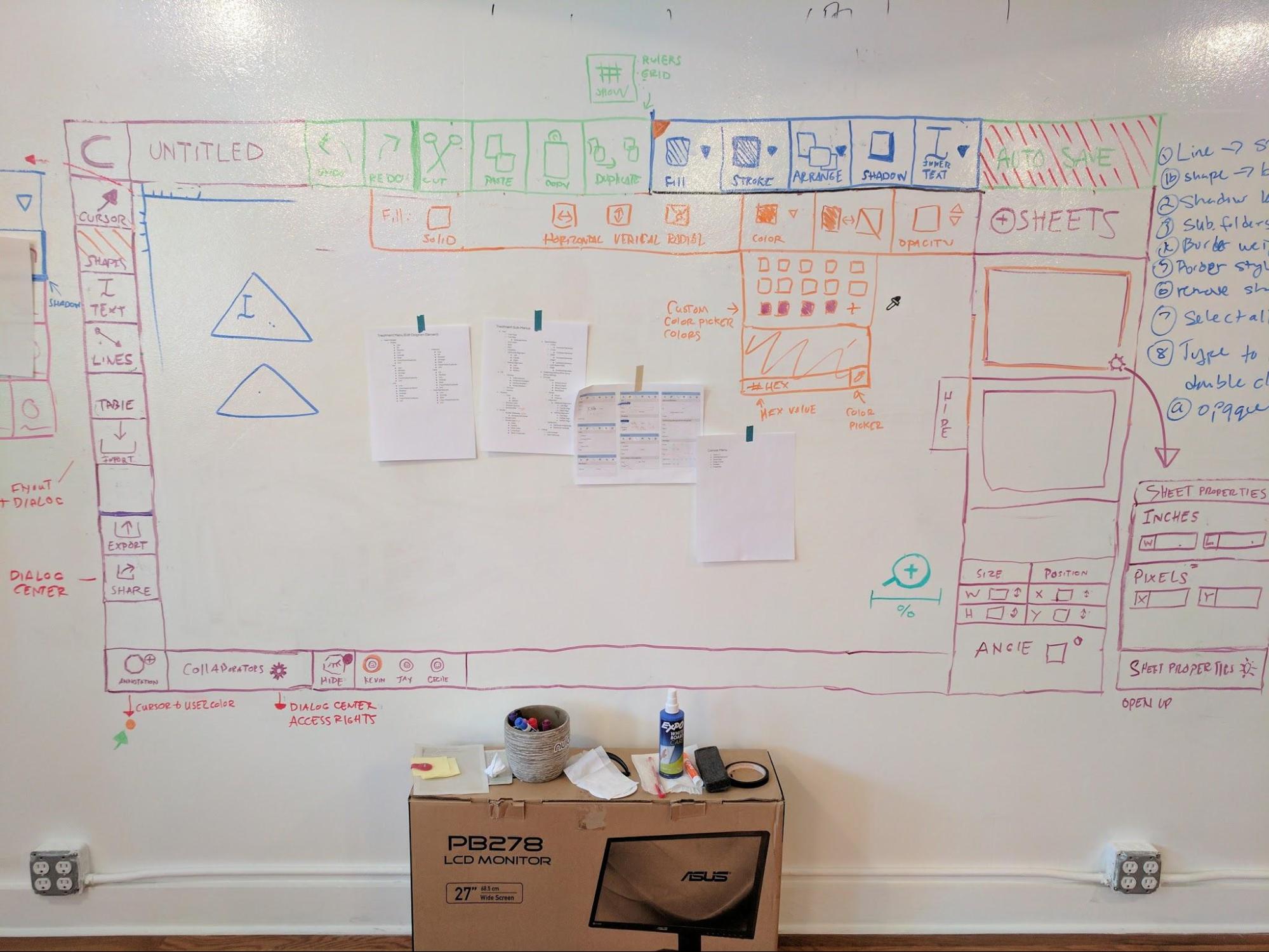
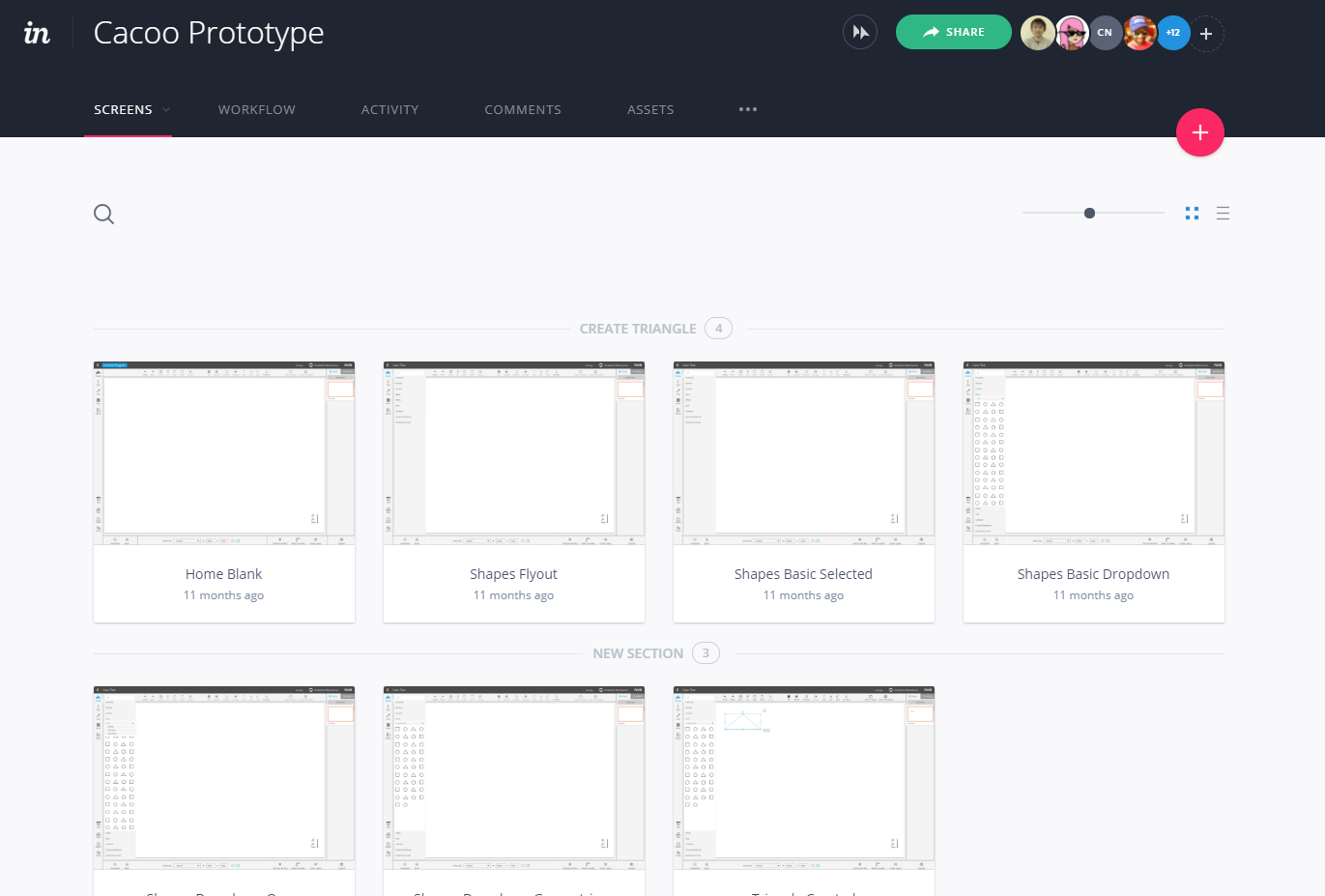
New concepting and prototyping methods
As these initiatives were implemented, all Nulab employees were encouraged to learn and adopt UX philosophies. The UX team is comprised of one researcher and four designers. It’s impossible for the UX team to tackle every UX challenge. However, if everyone could be educated to become more aware of UX principles, they could certainly help.
In addition to regular discussions about UX throughout the course of everyday work, a public communication channel was set up to communicate UX-related educational resources that anyone could access.

Making Cacoo customer-centric
Following the establishment of new UX focused initiatives, multiple rounds of research, countless design iterations, and organization-wide skills and knowledge growth, Cacoo is now reimagined, according to its customers.
After analyzing customer feedback, we discovered that our customers have a common goal: to organize, visualize, and communicate complex ideas. In other words, diagrams present ideas for others to easily understand.
Cacoo is now focused on facilitating that common goal and making the experience, easier, more efficient, more collaborative, and more pleasant, overall.
Here’s what we did:
Modernized and simplified the aesthetic
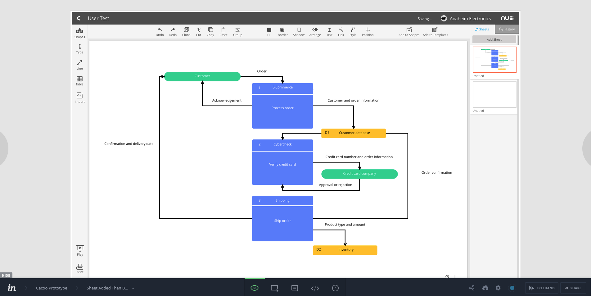
Modernizing the aesthetic goes beyond bringing things up to date. We focused on making things clean and inviting. The light color scheme and simplified interface are intended to help you focus on working with your ideas without being distracted by the tool.
Old


New


Optimized the UI for fast learning and efficiency
Complexity is the bane of efficiency. Which is why we wanted to make using Cacoo as simple as possible. The fewer components you need to learn or memorize, the better.
To combat complexity, the entire Cacoo interface was simplified and redesigned to align with how you think. Menus, labels, icons, EVERYTHING, were rethought to make diagramming easier and more efficient.
Enhanced features for collaboration
One of the best ways to develop an idea is to discuss it with others. To help promote discussion, a commenting feature was added to Cacoo. Collaborators can place comments anywhere on a diagram and anyone can reply. Click, and comment. Easy.

Cacoo’s Future
Cacoo’s redesign reflects improvements in our product, approach, and our organization. The new Cacoo is focused on you, our customers. And we’re excited to bring new customer-centric features and improvements in the future.
To try it out, simply log in to your Cacoo account, or sign up for a free trial here!


