Many marketers focus on copy, visuals, and campaigns — and for good reason. But did you know that the same principles UX designers use to make apps and websites intuitive can also improve marketing assets?
For example, a landing page with clear hierarchy and simple navigation is far more likely to convert visitors, while an email with concise, scannable copy and well-placed buttons can boost click-through rates. Even small adjustments, like shortening forms or adding alt text to images, make content more accessible and effective.
In this post, we’ll explore how applying UX principles can make your marketing assets not just visually appealing, but smarter — driving higher engagement, better conversions, and stronger results overall.
Why should digital marketers embrace UX principles?
Here are the benefits of applying UX principles to marketing assets:
1. Higher conversion rates
An accessible, usable, and engaging website enhances your customer experience and increases the chances of users taking further action.
2. User data collection
The UX team relies on ideal customer profiles (ICPs). In turn, marketers can use the same ICPs to personalize content for engagement and conversions.
3. Prominence in the market
By creating user-centric and engaging content, marketers can evoke an emotional response, imprinting their brand in customers’ minds.
4. Stronger customer retention
UX principles appeal to the genuine needs of their audience, making nurturing easier and helping to build loyalty, which in turn increases the likelihood of purchases.
5. Cohesive working community
The effective adoption of UX principles by marketers encourages them to communicate with UX designers regularly, fostering strong bonds between employees.
UX principles for digital marketing assets
1. Usability
Whether it’s a social media page or complex dynamic content blocks in your emails, they all must be easy to navigate so users can find relevant information and make purchases without having to jump through hoops.
For the most part, increasing the usability of your assets is on user interface (UI) designers. For example, when creating a website or marketing email design, they should arrange buttons and banners intuitively and avoid elements that overwhelm the layout.
Copywriters, in turn, ensure that the wording is clear, concise, brand-on, and helpful. They can enhance usability by breaking copy into smaller chunks and lists and creating compelling CTAs.
Whenever a marketing asset isn’t good enough to drive conversions, CRO professionals might step in to mobilize UX and digital marketing teams using the following strategies:
- Analytics: UX specialists track user engagement metrics or conduct heatmap analytics to identify whether a marketing asset performs as projected
- Enhancement: The digital marketing team upgrades content according to UX guidelines,
- Usability testing: UX designers use performance marketing software like Phonexa to test the results.
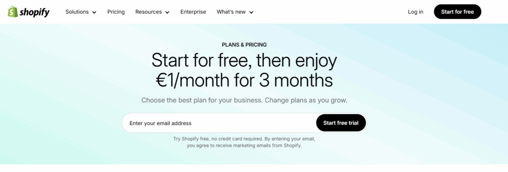
Example: Shopify uses plain language and a few concise words to convey the essence of their free trial. The platform requests only an email to generate leads and open possibilities for converting them later, even if they don’t start a free trial now.
2. Consistency
Show people the yellow “M” letter on the red background, and they think about McDonald’s – that’s what consistency does. Besides building a brand image, consistency also makes UX more understandable and predictable.
Visuals
Marketing professionals should synchronize content across social media, websites, email campaigns, and other platforms. Using the same banners, branded graphics, and images helps maintain a consistent brand identity.
Functionality
Buttons throughout the website, emails, or mobile applications should behave consistently. For example, keeping the registration/login button yellow allows users to quickly scan pages for this color whenever they want to authorize an action.
Tone of voice
Copy should align with your brand’s identity and resonate with your target audience. For instance, B2B companies should convey professionalism, while food delivery brands should use straightforward language that appeals to a broad audience.
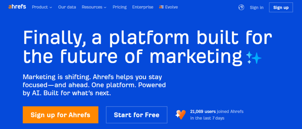
Example: Ahrefs is easily recognized among SEO marketers thanks to its visuals. The company adorns its marketing channels with iconic blue and orange colors that are distinct from competitors.
3. Accessibility
You want to tailor your customer journey to as many people as possible, regardless of their abilities or disabilities.
These tips will help you with that:
- Keyboard navigation: Enable users who can’t use a mouse to browse your content and make purchases easily.
- Alt texts: Describe images so people with slow internet or disabled image display still get the gist.
- Video transcriptions: Make videos accessible for deaf users or those in noisy environments.
- Flashing content warnings: Protect users with photosensitivity by alerting them to flashing visuals.
- Text contrast: Ensure there’s enough contrast between text and background for easy reading.
- Media compression: Optimize images and videos to speed up loading and improve user experience.
Most importantly, you want to support your website with a potent content delivery network (CDN). It can potentially double the loading speed of your pages. Moreover, CDNs are often provided in packages, offering malware removal, website migrations, DDoS protection, and other features that benefit businesses.
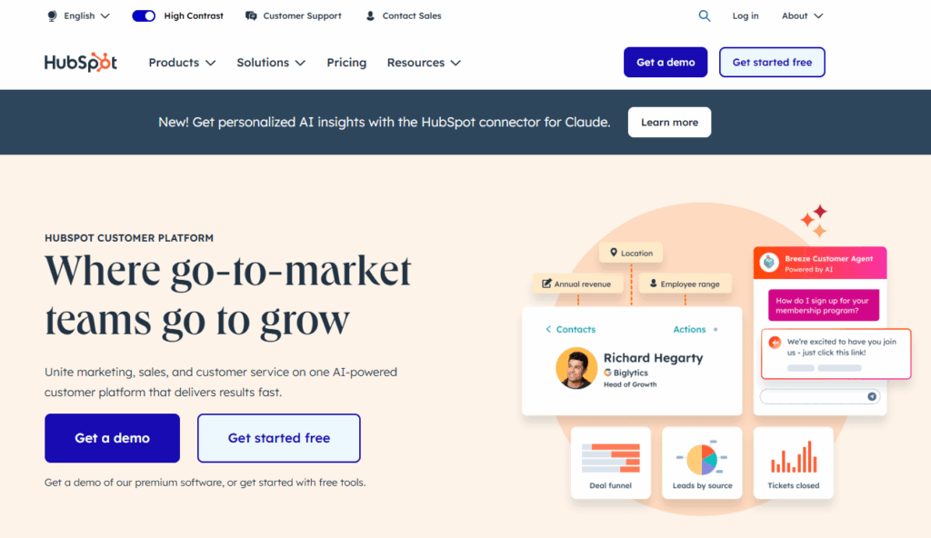
Example: At HubSpot, users can add more contrast to “Get a demo” and “Get started free” buttons with a persistent knob. This control doesn’t affect other website elements, as they’re highly readable on their own.
4. Engagement
While accessibility makes marketing assets easy to use, engagement facilitates a pleasant UX, which you can achieve by using quizzes and surveys. In addition to diversifying your users’ journeys, interactive content makes it personal and deepens personalization.
Likewise, you can use calculators. They work well for the broadest range of industries, from finance to fitness, providing recommendations that set the stage for offering user-tailored products and services.
These are some of the ways to implement responsive design and interactive elements:
Loading indicators
- Animations or progress bars for page loading
- “Typing” indicators for live chats to show responsiveness
Input feedback
- Inline validation to highlight errors
- Placeholders to guide users
- Confirmations to ensure successful submissions
- Can be automated with conversational chatbot flows for smoother communication
Hover effects
- Mouse changes form or color when hovering over specific website elements
Navigation
- Animations that push content into view as you scroll
- Interface elements that stick to the screen for easier access
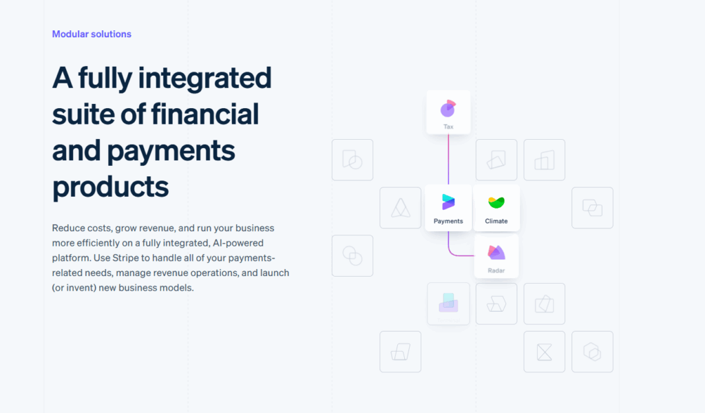
Example: Below, you can see a panel displayed on Stripe’s home page. Hovering your cursor above it highlights the icons – click on any of them to learn more about a specific product feature.
5. User-centricity
According to recent studies, while 85% of businesses think that their experiences are personalized, in reality, only 60% are. The root of the problem is in the frantic approach that doesn’t allow companies to create a single overarching marketing strategy.
So, to build a user-centric marketing strategy, start by creating ICPs. Gather information through interviews, forums, and personal experiences to tap into your audience’s minds. This will unlock personalized marketing, and then you can take it from there.
Here are some instruments that can help you study users’ behaviors:
- Cookies: Text files embedded in users’ browsers to record users’ data, such as location, marketing channel, language preferences, and more
- Tracking pixels: Invisible pixels integrated with websites or emails that reveal actions completed with specific marketing assets
- Analytical platforms: Hubs that gather and provide information about users’ past actions across the web
- Customer relationship management (CRM) systems: Consolidate behavioral tendencies into a single system, enabling holistic personalization
Gathered data affects your business across the board, allowing you to display ads and website homepage offers according to prospects’ genuine interests, not just clicks. A good example of this is intensifying Black Friday promotions for users who prefer shopping during massive sales.
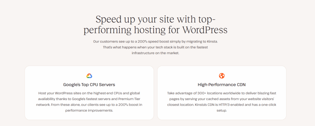
Example: Kinsta, a popular WordPress hosting service, knows that the majority of its clients want to increase their website speed. The platform addresses that – become our client to boost your website speed by 200%.
6. Content hierarchy
With up to 10,000 ads displayed daily, it’s no surprise that capturing attention is the biggest marketing hurdle. And while you can be a wordsmith to the bone, you can only make your content stand out with a clear, well-structured hierarchy.
The most effective strategy is to organize your marketing assets according to their value and role in the marketing funnel. Identify banners, links, and forms with the highest conversion rates and display them before other marketing assets, ideally at the beginning of the page.
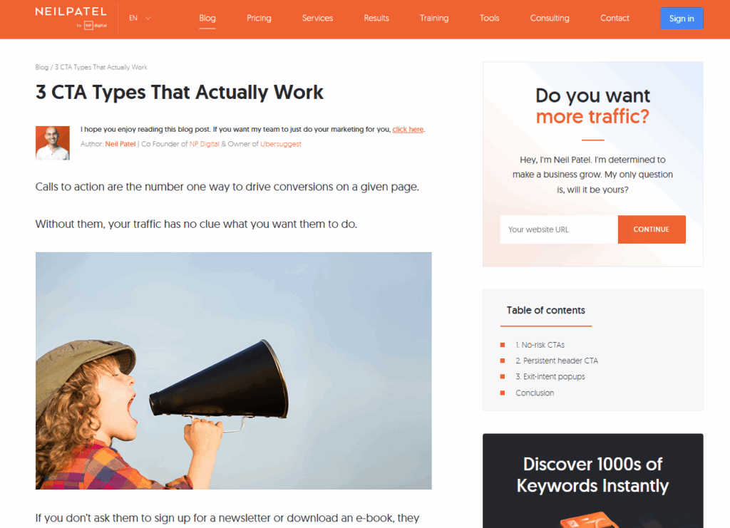
Example: Neil Patel’s CTA page illustrates the main hierarchy principle. There’s a banner before the text and key marketing assets throughout the page.
7. Relevance
Every encounter with your brand must align with where the user is in the funnel. Otherwise, you risk being obtrusive and putting off potential clients. The marketing funnel is often divided into three main stages—ToFu, MoFu, and BoFu—each representing a different point in the buyer’s journey:
ToFu (Top of Funnel) marketing assets
This is the awareness stage. Users at this point may not even know your brand exists or fully understand their own problem. ToFu marketing assets aim to become a helpful resource, educate your audience, and build brand awareness. Examples include blog posts, social media content, infographics, and free guides. The goal here is not to sell immediately but to provide value and start building trust.
MoFu (Middle of Funnel) marketing assets
This is the consideration stage. Users are now aware of their problem and are evaluating potential solutions. MoFu assets subtly position your offer as a solution, helping prospects see how your product or service could meet their needs. Examples include case studies, webinars, email nurture campaigns, and product demos. The aim is to guide users closer to a decision without being pushy.
BoFu (Bottom of Funnel) marketing assets
This is the decision stage. Users are ready to make a purchase but may need a final nudge. BoFu assets evoke urgency and showcase why your solution is the right choice. Examples include free trials, discount offers, detailed product comparisons, and customer testimonials. The goal is to convert interested leads into paying customers by providing reassurance and prompting action.
By the way, did you know that red CTAs perform 21% better than green? Make sure to color your assets according to the psychology of color perception.
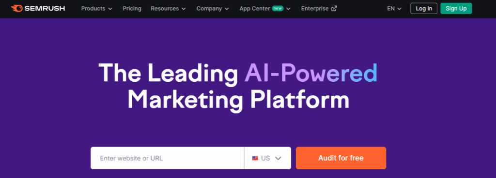
Example: Typical Semrush homepage users are somewhere between the middle and the bottom of the funnel, which is why they offer “Audit for free,” a conversion-preceding button, in vivid orange. Notice how it stands out in comparison to the black “Log In” and green “Sign Up.”
4 ways to improve your marketing through UX design
As powerful as the abovementioned UX principles are, not every digital marketer uses them to their advantage. A remedy to this lies in establishing closer communication between your digital marketing and UX teams.
Here’s how you can do it in five steps:
1. Establish shared language and goals
Begin by involving UX designers and marketers in strategizing your marketing. This way, both teams can develop shared ICPs and focus on relevant product features, with fewer disparities during marketing asset creation.
You should also encourage the UX team to explain the goals behind their tasks. They want a 10% increase in conversion rates? Ensure this information reaches everyone who’s involved.
2. Brainstorm ideas
Gathering digital marketers and UX designers together and letting them discuss their work is a decent way to spark productive ideas.
Here’s a walkthrough of three primary brainstorming steps:
- Preparation: Set the goal, invite people, and share introductory information
- Brainstorming session: Connect in voice chat and let your colleagues pitch ideas
- Summary: Summarize and share the brainstorming results
To ensure that everyone’s voice is heard, consider using digital whiteboards. Caccoo is a great option to visualize ideas, create diagrams, and share images in real-time.
3. Automate task assignment
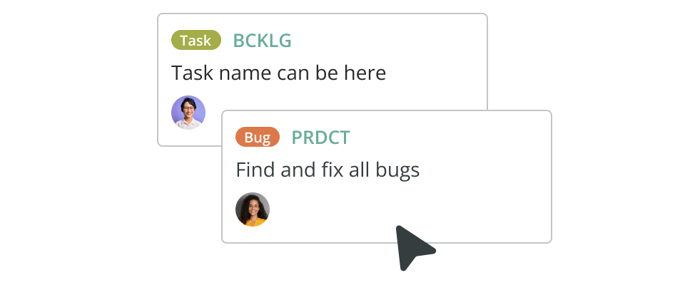
Begin by implementing CRM channels – they’re a must-have for calling and chatting. Also, consider Backlog, Jira, Trello, and other content management services to let your employees assign tasks, set deadlines, and provide feedback.
Pro tip: Solutions like Backlog consolidate communication and management, also enabling additional features such as task tracking, exploring your project pipeline, and managing team workflows.
4. Professional training
Teaching your digital marketers content design, and UX specialists marketing content creation increases appreciation between roles and grows skills. Although classic courses work well, shadowing is way better.
Shadowing suggests, for example, that UX designers share their knowledge with marketers, which is the most straightforward way to teach them UX principles.
Measuring the impact of UX in digital marketing
Once your digital marketers start adopting UX principles, you want to measure the results so your employees know whether they are moving in the right direction.
- Click-through rate (CTR)
- What it measures: The percentage of impressions that translate into clicks
- How to improve: Focus on user-centricity by making content and CTAs more relevant to your audience
- Conversion rate
- What it measures: The percentage of visitors who take the desired action
- How to improve: Make your marketing assets more engaging and accessible
- Engagement rate
- What it measures: How actively users interact with your content
- How to improve: Create interactive content and optimize targeting and timing
- Time to complete
- What it measures: The time required for a user to fill out a submission form
- How to improve: Eliminate excessive fields and add clear instructions
- Unsubscribe rate
- What it measures: The percentage of people who opt out of your emails
- How to improve: Align your emails with the stages of the marketing funnel
Last but not least, always test everything you’re implementing. A/B testing can help identify the best marketing assets for specific audiences and quantify the impact of UX principles on digital marketing.
Here’s how you can conduct A/B testing:
- Identify areas for improvement: Use metrics or marketing software to detect friction points within your asset
- Create content variations: Encourage digital marketers to produce multiple versions of banners, CTAs, forms, and else
- Start testing: Use Google or marketing software to split your traffic into 50/50 channels to determine a superior asset
Final thoughts
By applying UX principles to marketing assets, you enhance the communication between your brand and your audience, maximizing engagement across the board.
However, don’t expect your marketers to be jacks-of-all-trades. Instead, incentivize collaborations between UX and marketing departments to ensure that your marketing assets are optimized, well-targeted, and well-timed.
Author bio

Artem Vasilenko writes data-driven articles for Phonexa, exploring innovative technologies and marketing strategies that help elevate brands. He also speaks to business executives and marketers, sharing insights that connect strategy with innovation.
About Author