In the business world, standing out isn’t just about being seen — it’s about being recognized and remembered. This is where the power of a brand identity kit shines.
An identity brand kit, or brand kit for short, is the visual DNA of your organization. It helps to ensure every touchpoint — whether that’s social media, product packaging, or affiliate marketing — communicates your organization consistently. And that’s something that pays off: according to Global Banking and Finance, a staggering 71% of consumers are more likely to buy from a brand they recognize.
In this article, we’ll explain what a brand kit is, why it works, and most importantly, how to make one yourself, with lots of examples to get your creative mind whirring. So let’s get started!
What is a brand identity kit?
A brand identity kit is essentially your brand’s visual blueprint. It comprises all the key elements that visually communicate your brand’s identity. Here’s what typically goes into it:
- Logo(s): Includes your main logo and any variations
- Color palette: Specific colors associated with your brand, including primary and secondary colors with specific color codes (e.g., HEX, RGB)
- Typography: Fonts and typography guidelines for how text should appear in your brand materials
- Imagery and icons: Approved images, icons, and graphics that represent your brand
- Brief guidelines outlining your values and voice: Instructions on how to apply these elements consistently across various mediums, as well as general tips on your brand’s values and tone of voice.
This kit is the go-to resource for anyone who creates or manages content for your brand, helping ensure every piece of communication is unmistakably ‘you.’
Brand identity kit vs style guide vs brand guidelines
When it comes to crafting a brand’s visual and verbal identity, the terms ‘brand kit,’ ‘style guide,’ and ‘brand guidelines’ get tossed around like leaves in the wind. And while they are sometimes used interchangeably, each serves a unique purpose in the branding ecosystem.
Let’s take a closer look.
Brand identity kit
This is your brand’s visual toolbox. It’s a practical collection of all the graphic elements that make up your brand’s visual identity, such as logos, color palettes, typography, and imagery. It’s largely focused on visuals, and the goal is to ensure consistency in how your brand appears across various mediums.
Style guide
A style guide dives deeper into the specifics of how to use the elements contained in the brand identity kit. It provides detailed instructions on logo placement, color usage, typography settings, and more.
While a brand kit gives you the components, a style guide tells you how to use them effectively, adhering to the same quality and style standards. Sometimes, the phrase refers purely to guidelines for the written word — for example, the Chicago Manual of Style, which is a comprehensive guide to style, usage, and grammar used by writers and editors.
Brand guidelines
This is the comprehensive manual of your brand’s identity, encompassing both the brand kit and the style guide but also adding the brand’s voice, tone, and strategies.
Brand guidelines cover how to communicate your brand’s personality through both visuals and language. It includes do’s and don’ts for writing copy, guidelines for photography, and even social media interaction styles. Consider this the complete encyclopedia of your brand, offering everything anyone would need to know to represent your organization accurately.
| Aspect | Brand identity kit | Style guide | Brand guidelines |
| Focus | Visual identity | Usage specifics | Complete brand experience |
| Contents | Logos, color palettes, typography, imagery | Instructions on logo placement, color usage, typography settings, grammar, and tone | Visual and verbal identity, including tone, messaging, and communication strategies |
| Purpose | Ensure visual consistency across mediums | Guide on how to use brand elements effectively, and/or TOV | Comprehensive manual for representing the brand accurately |
| Users | Designers, marketers | Designers, content creators, writers, editors, proofreaders | Entire organization and external partners |
Why you need a brand identity kit
In the sea of brands clamoring for attention, standing out is key. But it goes beyond just catching people’s eyes: consistency plays a starring role in making your brand memorable and trustworthy.
Here’s why a brand identity kit is not just helpful but essential:
- Instant recognition: A cohesive visual identity helps your audience recognize you instantly, whether they’re scrolling through social media or browsing a brochure.
- Efficiency in creation: With a set of predefined brand elements, creating new marketing materials is quicker.
- Consistency builds trust: When your brand looks the same across all platforms, it builds trust with your audience. Inconsistency can be confusing and may erode credibility.
- Ease of collaboration: Sharing your brand’s visual guidelines with new team members, partners, or external agencies helps align everyone involved, making collaborations smoother.
How (and why) brand identity kits work
First off, the impact on revenue cannot be overstated. Forbes puts it plainly: brands with consistent presentation see a revenue uptick of about 23%. This isn’t pocket change: it’s a clear indicator that when customers recognize and trust your branding, they’re more likely to open their wallets.
Then there’s the efficiency angle. By streamlining the design process with set templates and guidelines, you’re not just saving pennies; you’re also saving sanity.
Engagement is another critical piece of the puzzle. A consistent brand approach can boost visibility: the easier it is for people to recognize your brand, the more likely they are to interact with it. Demand Metric’s research is eye-opening, revealing that consistent branding makes you 3.5 times more visible to your audience. In a crowded marketplace, that level of visibility is gold — it builds reputation and cements customer loyalty.
So, while the structure of a brand identity kit might seem like just another task on the to-do list, its effects are far-reaching. From bolstering your bottom line to making your brand a beacon for your target audience, the right brand kit transforms the abstract into the tangible.
What should you include in your brand kit?
Before we get into the how, let’s take a quick look at what your brand kit should contain.
- Logo variations: Include your primary logo along with any alternative versions (e.g., monochrome, vertical, horizontal). Specify usage scenarios for each.
- Color palette: Detail your primary and secondary colors with specific codes for print (CMYK) and digital (RGB, HEX) for consistency.
- Typography: Outline the fonts and specific font weights to be used for headings, subheadings, and body text. Include web-safe alternatives if necessary.
- Imagery style: Define the style of photography, illustrations, and any graphical elements that align with your brand. This could also include guidelines on how to source or produce images.
- Iconography: If your brand uses custom icons, include them here with notes on when and how to use them.
- Brand voice and tone: Even though primarily visual, including a brief overview of your brand’s voice and tone can guide how text is paired with your visuals.
- Business card and letterhead designs: Ready-to-use templates for business communications ensure that even your emails and letters are branded.
- Social media templates: Pre-designed templates for social media posts and profiles can streamline content creation and maintain visual consistency.
- Do’s and don’ts: Give clear examples of what to do and what not to do with your brand assets. This can prevent common mistakes and misuse of your brand elements.
How to build a brand identity kit
Building a brand kit is essentially about gathering and organizing your brand’s visual elements in a way that’s easily accessible and understandable. Here’s a step-by-step guide to help you.
1. Audit your existing brand elements
Start by collecting all current brand assets. This includes logos, color palettes, typography, imagery, and any other materials that have been used in your brand’s communications. Evaluate what aligns with your brand’s identity and what might need updating.
2. Define your brand’s visual identity
If you haven’t already, clearly define your brand’s visual style. This includes selecting a color palette, typography, and imagery that encapsulates your brand’s personality and values. Consistency in these elements is key to making your brand memorable!
3. Create logo variations
Design different versions of your logo for various applications — think about different sizes, orientations (horizontal and vertical), and color variations (full color, monochrome). Include guidelines on how each version should be used.
4. Standardize your color palette
Document your primary and secondary colors with specific color codes for digital (RGB, HEX) and print (CMYK, Pantone) so they’re reproduced accurately across different mediums. Don’t leave designers to guess colors.
5. Select your typography
Choose a set of fonts that complement your brand’s style. Include guidelines on how these fonts should be used for different types of content (e.g., headings, body text, video, print, and so on).
6. Develop imagery guidelines
Define the style of photography and illustrations that fit your brand. Include examples and usage with examples of both correct and incorrect usage. Add detailed notes for photographers/videographers and designers, including how to ensure consistency in pre and post-development.
7. Design templates for common materials
Create templates for frequently used marketing materials, like business cards, letterheads, social media posts, email newsletters, and franchise/microsites. This will make it easy for your team to create new materials that are on-brand, right down to website layouts.
8. Compile brand voice and tone guidelines
Although your brand kit focuses on visual elements, including a brief section on your brand’s voice and tone can guide how text is paired with visuals. This isn’t a style guide — but you could link to your guide from here (if your kit is digital).
9. Organize your assets
Use a digital asset management tool or a simple cloud storage solution to organize your brand assets. Make sure they’re easy to access and use by anyone who needs them.
10. Share your brand identity kit
Distribute your brand kit to your team, external partners, and anyone else who creates content for your brand. Include clear instructions on how to use the assets correctly.
11 brand identity kit examples
Seeing how others have done it can really help you with your own mission. Here are 11 from some of the biggest brands around.
1. Apple
Apple’s brand kit for resellers focuses on simplicity, elegance, and clean design, reflecting its design philosophy. The guidelines cover logo usage, typography, color palette, and imagery, emphasizing minimalism and consistency.
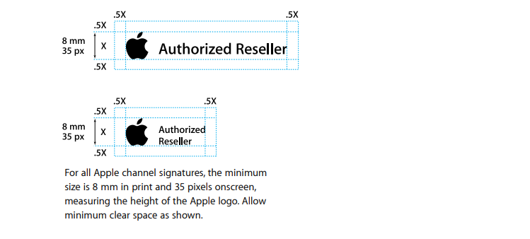
What to look for: Pay attention to how Apple’s guidelines detail the precise use of the Apple logo, including minimum sizes, clear space requirements, and the prohibition against altering or distorting the logo in any way. The guidelines also showcase the brand’s iconic monochromatic color scheme and the use of sleek, sans-serif typography.
2. Google Trends
Google is known for its emphasis on color, simplicity, and accessibility. Their brand kit provides detailed instructions on logo treatment, the famous Google color palette, typography, and the use of imagery and icons.
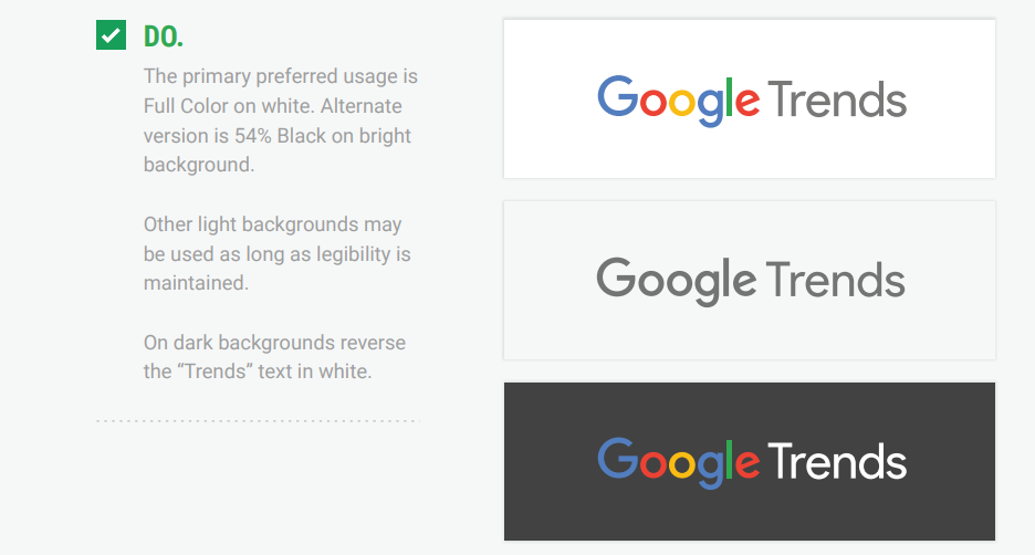
What to look for: Google’s playful yet straightforward approach to its brand elements. Notice how the guidelines articulate the use of their vibrant color palette and the Roboto typeface, ensuring readability and brand recognition across various applications.
3. Nike
Nike’s graphic guidelines focus on boldness and inspiration, with a strong emphasis on their iconic swoosh logo, motivational messaging, and dynamic imagery.
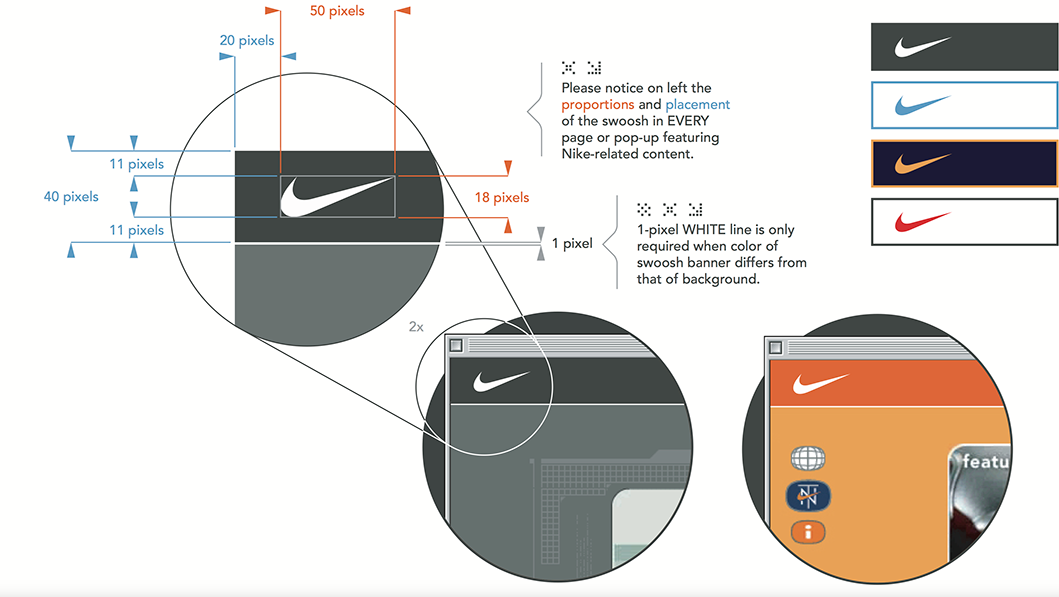
What to look for: The use of the swoosh logo across different mediums, the guidelines for brand messaging that inspires action, and the dynamic, high-energy photography style that captures the essence of athleticism and determination.
4. The Coca-Cola Foundation
The Coca-Cola Foundation’s visual identity highlights the brand’s heritage and the emotional connection with its audience, focusing on the Coca-Cola script logo, the red and white color palette, and the brand’s tone of voice.
What to look for: The specific use of the Coca-Cola colors, guidelines for the application of the script logo, and the way Coca-Cola’s guidelines encourage consistency across digital and physical branding.
5. Airbnb
Airbnb’s visual guidelines focus on the brand’s color palette, typography, spacing and digital layouts.
What to look for: The application of Airbnb’s warm and inviting color scheme and the meticulous attention to page navigation.
6. IBM
IBM’s brand guidelines for third parties are comprehensive, reflecting the company’s long history and its position in the technology sector. It focuses on simplicity, functionality, and the organization’s signature color scheme.
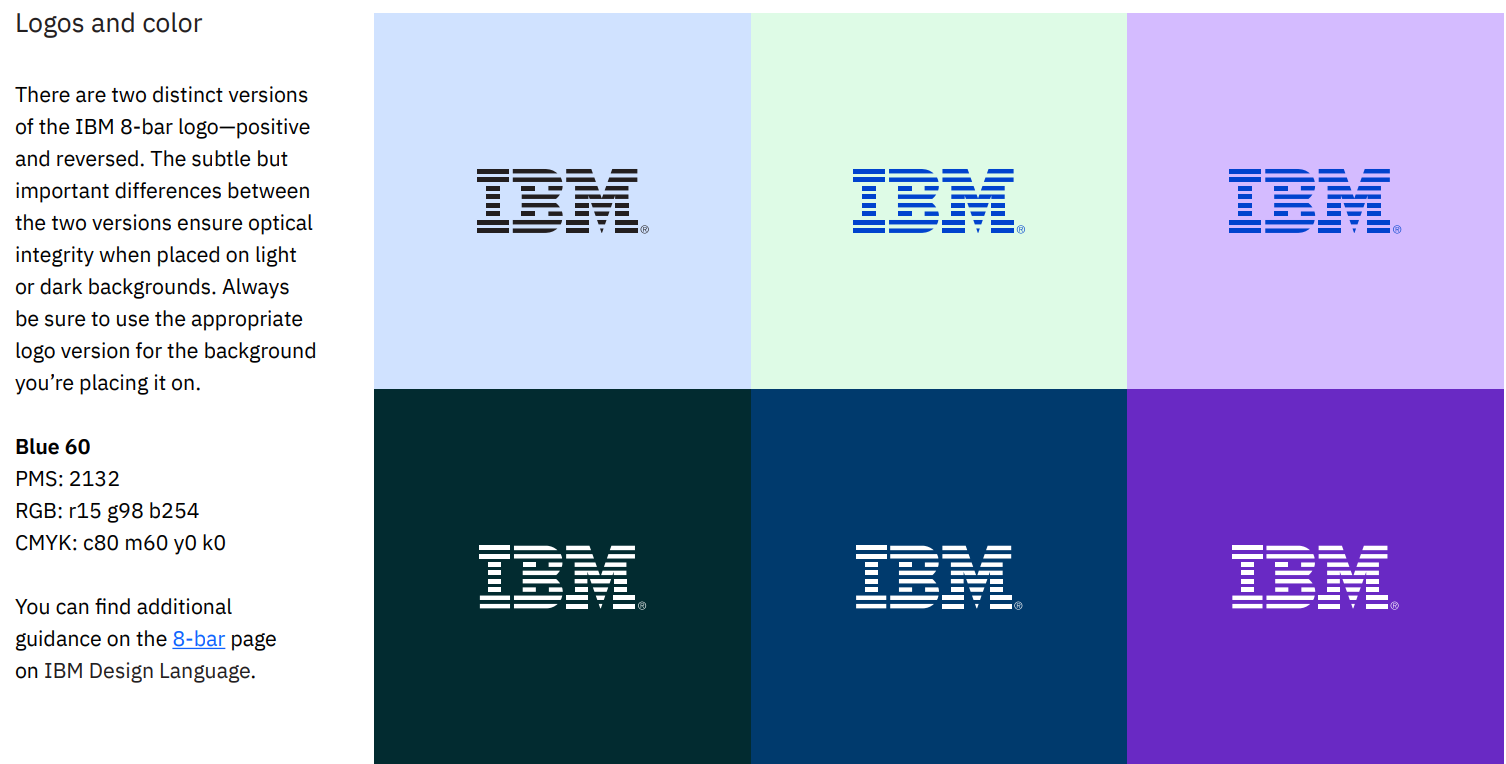
What to look for: The guidelines detail the use of the iconic 8-bar IBM logo, with detailed advice on how to apply brand colors.
7. McDonald’s
McDonald’s brand guidelines highlight the food chain’s most iconic elements, including its Golden Arches, the use of red and yellow, and how to ensure clarity in the visual realm.
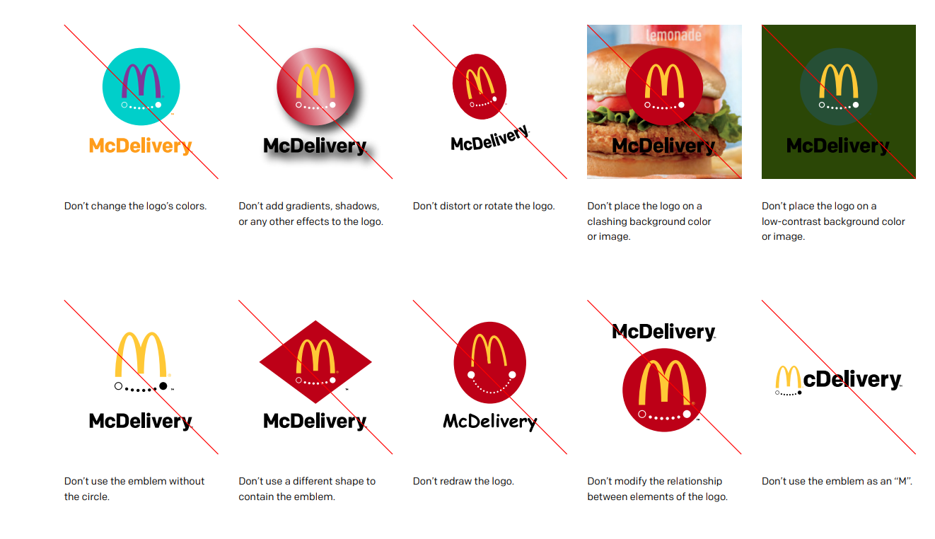
What to look for: The specific applications of the Golden Arches, the vibrant color scheme, and the ‘violations’ tips.
8. Spotify
Spotify is known for its dynamic and expressive use of color, imagery, and typography. Its design guidelines for developers sets out clear instructions for platforms integrating Spotify in a way that ensures brand consistency.
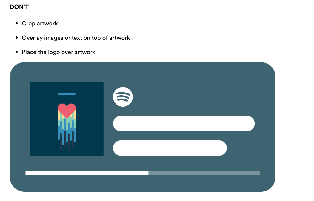
What to look for: The use of bold, vibrant colors, unique duotone imagery, and the emphasis on clear, consistent layouts. The guidelines also cover the brand’s approach to naming conventions.
9. Adobe Creative Cloud
Sitting somewhere between brand guidelines and a brand kit, Adobe’s Creative Cloud design guide emphasizes consistency across desktop, mobile, and web. It meticulously details the use of their logo, color palette, typography, and imagery across Adobe’s vast range of products and services.
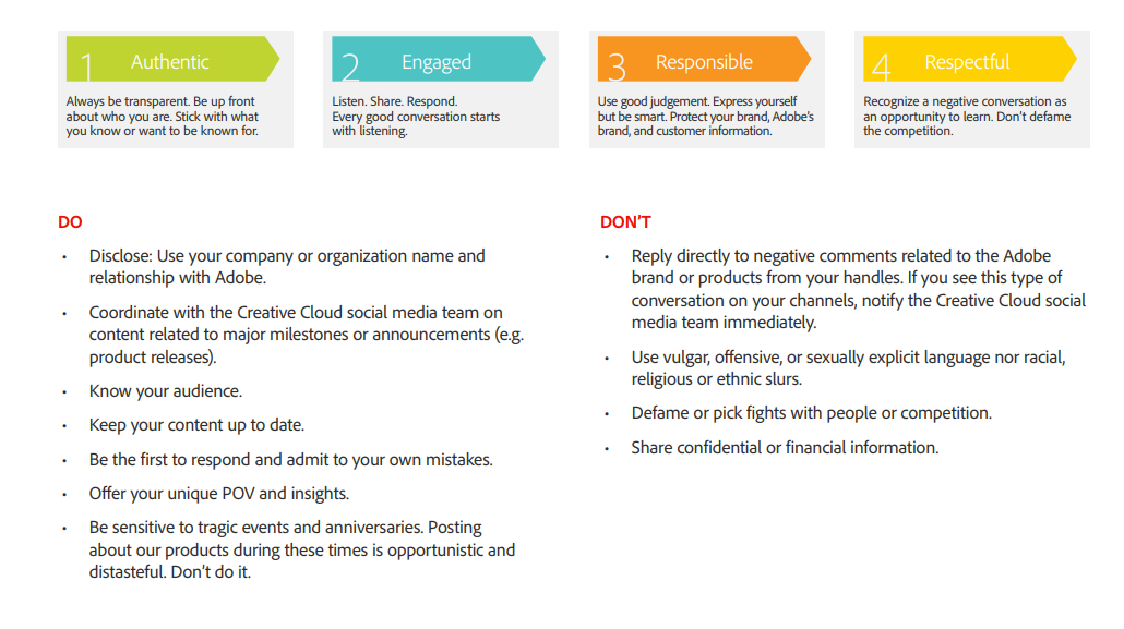
What to look for: The brand’s social media principles, which includes a list of rules for behavior. Instructions on how to use product names, abbreviations, and legal lines — plus an array of ‘bad’ examples to avoid.
10. Lego
Lego’s e-tailor brand guidelines capture the playful, creative spirit of the brand. It includes detailed instructions on logo usage, a bright and versatile color palette, and guidelines for imagery that showcase the product’s potential for imagination and storytelling.
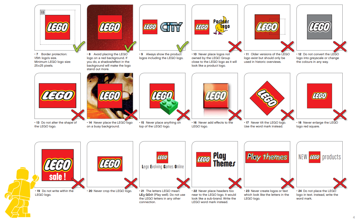
What to look for: The playful yet precise use of the Lego logo variants, and the emphasis on colorful, engaging imagery that appeals to both children and adults.
11. Netflix
Netflix’s brand site offers a repository of information on logo usage, color schemes, and typography for third parties using the branding. It’s a one-stop brand kit for anyone using the branding across print and digital.
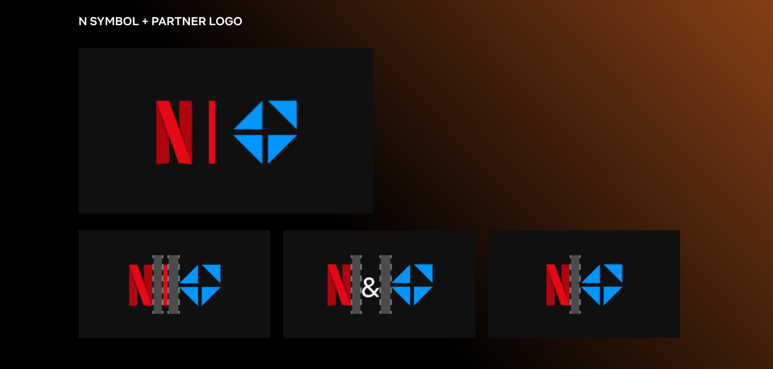
What to look for: The guidelines for the Netflix logo, ensuring it remains recognizable and clear across different backgrounds and contexts, the minimalist color palette that supports a focus on content, and the guidelines for combining the logo with partner logos.
Final thoughts
As your brand evolves, so should your kit, adapting to new markets and consumer expectations along the way. Let it be a living document that grows with your organization!
Consistency is key in both branding and project management, so using tools built for adaptability is a must. This is where project management tools come in handy.
When you make your brand kit collaborative and cloud-based, it becomes an integral part of your strategic process (rather than a document you create and forget), boosting consistency and efficiency throughout its entire lifecycle.
Backlog, our project management tool, makes brand kit creation a breeze. Simply set up a new project, invite participants, assign tasks, and track progress. Meanwhile, automatic notifications keep the entire team up-to-date, while adjustable access rights mean you can share as much or as little with your stakeholders as you like. Ready to give it a try?
About Author

Georgina Guthrie
Guest authorGeorgina is a displaced Brit currently working in France as a freelance copywriter. Before moving to sunnier climates, she worked as a B2B agency writer in Bristol, England, which is also where she was born. In her spare time, she enjoys old films and cooking (badly).