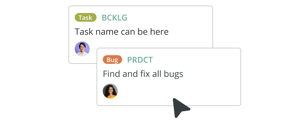
Have you ever wondered how users actually move through your site? The shortcuts they take, where they rage-click, or drop off entirely? A user path analysis reveals exactly that, showing how people interact with your app or website — from the good, to the ‘meh’, to jabbing a phone screen in pure frustration.
When visitors can’t find what they need fast enough, they leave. You don’t get a conversion, and they have a negative impression of your brand. But when navigation is smooth, they stay, and most importantly, convert. In this guide, we’ll explain why user path analysis matters and how to run one effectively to uncover what’s working (and what’s not).
What is a user path?
A user path (aka user flow) is the route someone takes through your website or app — from their first click to their final action. It shows every step and drop-off along the way.
For example, let’s say we have an e-commerce store with an “add to cart” button leading to a checkout page. The user path would begin when the shopper clicks the button and end when they complete — or abandon — their purchase.
Mapping these paths gives you a visual story of how people experience your product. Where they move smoothly, where they hesitate, and what ultimately leads them to convert or make off into the night.
What is a user path analysis?
A user path analysis is the process of tracking and visualizing how people move through your website or app. It combines two layers: the visual journey (the map) plus the behavioral data (the analysis). Together, they reveal how users actually interact with your product.
By mapping these flows, you can see which routes lead to success and where users get stuck. It’s a practical way to identify friction, uncover high-performing “happy paths,” and make smarter design and UX decisions based on reality, rather than guesswork.
Why a user path analysis is so vital
A user path analysis helps you pinpoint moments that stop users from completing their goals — often caused by simple design choices, such as unclear labels or interactions. It also reveals where people get stuck or leave without finishing an action, and how often this happens.
Beyond spotting friction, user path analysis also shows what’s working — the patterns behind successful conversions. While tools like Google Analytics can highlight drop-offs between pages, a visual UX analysis goes further, mapping every step from entry to CTA.
The main benefits of a user path analysis
- Spot specific pages or steps where users drop off to reduce bounce rates
- Measure how long it takes for users to complete flows and find where things slow down
- Spot key touchpoints and see how easily customers can reach them
- Compare design variations side-by-side to learn which performs best
- Trace high-conversion “happy paths” that lead to sales or sign-ups
- Improve processes to boost satisfaction, loyalty, and long-term revenue.
What kinds of issues can a user path analysis help you solve?
Users can face all kinds of bottlenecks when working their way through a website or app. Let’s take a closer look at some of the more common issues, as well as how to fix them.
1. Conversion funnel leaks
Losing customers between steps means something’s broken — whether it’s friction at signup or unclear CTAs.
The fix: Analyze where drop-offs happen by user segment to pinpoint the cause. Then refine those steps or run targeted campaigns to re-engage users.
2. Bottlenecks, UX friction, and 404 pages
Bad UX can mean drop-offs or negative impressions. Broken links, confusing layouts, or long checkout flows all drive users away.
The fix: Once you’ve found your friction points, revisit the user path and test improvements using real data.
3. Poor campaign performance
Campaigns that drive traffic but no conversions may have user path problems.
The fix: Analyze how campaign visitors move through your site, where they exit, and why. Then focus on what’s working (and kill what isn’t).
How to run a user path analysis
Running a user path analysis isn’t something that can be done in a day — nor is it something you do once and forget about. It’s a process that is constantly evolving. And, with each iteration, you’ll gain more insight into the user paths people commonly take through your product. It’s not easy or fast, but it’s very much worth it.
1. Map out your user paths
Start by deciding which areas of your website or app to analyze. For example, by platform, device type, or user goal. Then, map out all possible paths someone could take, from entry to conversion.
You can do this on paper or in an online diagramming tool (which we highly recommend!). You’ll also need to identify where it is you want your users to go — these will be your conversion points.
Common user paths you might want to include:
- Sign-up process
- Login process
- Checkout
- Searching for specific key information
- Exiting the site or app.
Identify the actions that define success (such as checkout, sign-up, or content view) and mark the routes leading there. These will form your key user flows.
Tip: Keep in mind that people will likely bounce around between different paths during their session, so try and map out as many as possible (even those with low traffic).
2. Create user personas
You’ll then need to create personas before starting. Understanding who is following each path helps you interpret why. Define your main user groups — for instance, first-time visitors, regular customers, or returning subscribers — and note where their behaviors differ. A path that works perfectly for one group may frustrate another.
3. Analyze one path at a time
Walk through each journey step by step. Check that every interaction aligns with usability best practices: clear labels, visible buttons, logical order. If something feels clunky or confusing, flag it.
4. Double-check and prioritize
Not all issues are equal. Focus first on the most common paths and most frequent drop-offs. Document what you find — including the likely cause and potential fix — so the insights can be shared and acted on later.
To make this easier to maintain, add your most common patterns and flows into your diagramming tool. Include primary and secondary paths, recurring drop-offs, and the majority path users take.
5. Make sense of your visual data
Once your paths are mapped, the real work begins: interpreting what the lines and nodes are telling you.
Look for clusters where users concentrate — these usually mark clarity or motivation. Quieter branches might highlight content that’s hidden or irrelevant. Follow each journey until it breaks; drop-offs near forms, long load times, or unclear menus are rarely random. Pair those moments with metrics like dwell time or bounce rate to understand whether the issue is friction, timing, or context.
Don’t overlook what’s going well. Repeatedly successful journeys — your “happy paths” — reveal what users value most. Ask yourself what makes them work: the layout, the copy, the pacing? Replicate those strengths elsewhere for greater impact.
And remember, keep diagrams clean and legible. A simple, honest map often reveals more than a cluttered dashboard.
6. Bring in lived experience
A user path analysis can tell you what’s happening, but not always why. Behind every drop-off or detour, there’s a story — a moment of hesitation or frustration that numbers can’t fully explain.
To uncover those stories, combine your analytics with real-world feedback. Watch users navigate your product, ask short open-ended questions, and pay attention to where they pause or frown. These observations fill in the gaps your charts can’t reach.
When you pair quantitative data with qualitative, patterns start to make sense. A sudden spike in exits after a settings screen might connect to unclear language, or a successful path could trace back to an especially intuitive layout. The more perspectives you layer in, the richer your understanding becomes.
How to choose and use tools for your user path analysis
Before you start mapping user paths, make sure you have the right tools in place. Without accurate data, even the most detailed flow diagrams won’t tell you much.
1. Pick the right analytics platform
Start by choosing software that fits your goals:
- Google Analytics: best for tracking website traffic patterns, entry points, and exit pages.
- Amplitude: designed for exploring detailed product usage, showing how users move between specific features or screens.
- Mixpanel: useful for tracking individual user actions and running quick comparisons between user segments or time periods.
Each tool provides a slightly different lens, so pick one that aligns with your objectives and technical setup.
2. Configure event tracking
Decide which user actions matter most — such as signing up, searching, or checking out — and make sure each is properly logged. Consistent naming and tagging help your data stay clean and comparable over time.
3. Create a shared dashboard
Build a single dashboard where everyone — designers, marketers, developers, even clients — can see how users move through your site or app. Shared visibility keeps everyone on the same page and helps you spot issues faster.
Keep your analysis ongoing and audience-specific
Mapping user paths once gives you a snapshot — but user behavior changes constantly.
Treat your path analysis as a loop: observe, adjust, re-measure, repeat. Over time, this steady iteration sharpens both your product and your understanding of how people use it.
- Monitor over time: Review user paths monthly or quarterly. Track shifts in traffic flow or drop-off points. Spot trends early before they snowball.
- Segment your users: Compare journeys by device, region, or customer stage. What works for returning users might not for newcomers — differences that should guide improvements.
- Combine numbers with stories: Analytics show what happens; feedback shows why. Pair your data with user interviews or support tickets to uncover the reasons behind the patterns.
- Keep refining: Treat analysis as a loop: observe, adjust, measure, repeat. Over time, this steady cycle sharpens both your product and your understanding of how people use it.
Make your insights visible and usable
Once you’ve mapped your user paths, you’ll have a clearer picture of what’s working, what isn’t, and where to focus next. Just as importantly, these maps become a shared reference point for teams and stakeholders — rallying everyone around a shared goal.
This is where diagramming tools like Cacoo really shine. Rather than scrabbling around with bits of paper and folders full of outdated docs, you can create your user journey, share, add notes, and update with the click of a button. And since it’s cloud-based, your entire team can view and update diagrams together, in real time. Map your user journeys, share them, and refine them — all in one place. Try it for free today!
This post was originally published on October 13, 2021, and updated most recently on December 10, 2025.
About Author

Georgina Guthrie
Guest authorGeorgina is a displaced Brit currently working in France as a freelance copywriter. Before moving to sunnier climates, she worked as a B2B agency writer in Bristol, England, which is also where she was born. In her spare time, she enjoys old films and cooking (badly).