From early hunter-gatherers foraging for goods to ancient Roman architects building aqueducts, humans have always looked for ways to delegate work and break complex projects into smaller chunks. Project management is a task as old as time. Bearing this in mind, it’s no surprise that we’re continuously creating techniques to streamline our projects and measure and track productivity. That’s where PERT chart analysis comes in.
The Program, Evaluation, and Review Technique (PERT for short) is a popular project management tool that dates all the way back to the 1950s. Here’s how to use a PERT chart analysis to map out your next big project and get better results.
What is a PERT chart?
A PERT chart breaks down the separate tasks that make up a project and helps you analyze the time it will take to complete each task. It also helps you identify the minimum amount of time you’ll need to complete the entire project as a whole.
A PERT diagram is made up of arrows, rectangles, circles, or tables, which map a project’s tasks and the overall schedule. They can be very top-level and show only the most crucial stages of a project or are more detailed and granular. But at their simplest, PERT charts help you to:
- Anticipate the amount of time it’ll take to complete a project.
- Make informed decisions about complex projects.
- Spot new opportunities for project optimization.
- Determine a critical path to project completion, including task order.
- Factor in uncertainty, so you can schedule a project without knowing precise details and timeframes.
PERT charts vs Gantt charts
If you’re familiar with Gantt charts, then you’ll probably notice the similarities. Both diagrams divide projects into smaller tasks and organize the sequence of activities.
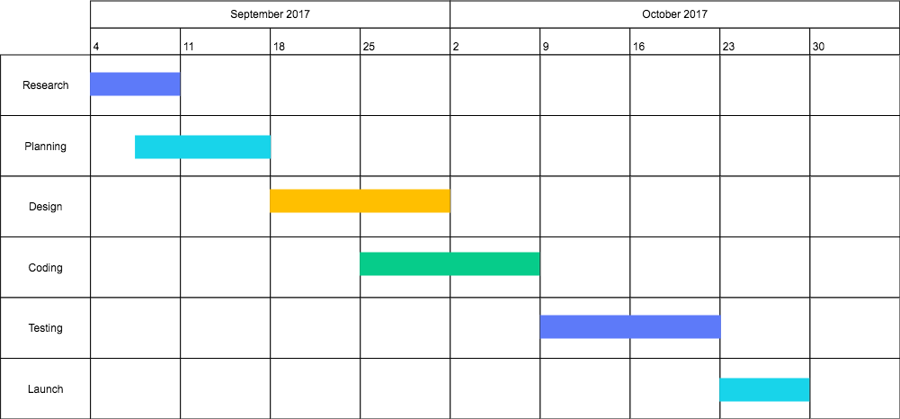
Gantt charts provide a timeline of smaller tasks with dates to show durations and completion times. You can picture them as a series of horizontal blocks that stretch across a calendar. As they’re essentially bar charts, Gantt diagrams depict the start and finish of a task and are 100 percent focused on time.

PERT charts are often used before the project begins to help you estimate more accurately. They focus on the relationship between different tasks, and, therefore, are useful for planning the flow of the project. Unlike the linear setup of a Gantt chart, a PERT chart is a type of network diagram with a multilayered sequence of activities.

PERT chart shapes & symbols
The rectangles or circles (known as ‘nodes’) indicate each completed phase of the total project. And arrows represent the activities or work necessary to reach each phase (or node). The direction of the arrows shows the sequence of tasks, including whether certain tasks are dependent on others or whether they can run simultaneously.
For instance, in the PERT chart example above, the first column represents tasks that can all be completed simultaneously. They don’t depend on other activities. However, the “Test Hardware” task depends on two other activity sequences. All of these tasks have to be scheduled correctly to allow enough time for later phases.
PERT chart terms you need to know
Critical Path: The longest path from the beginning to the end of the project
Float or Slack: The amount of time a task can be delayed before it causes an overall delay or impacts the other tasks
Critical Path Activity: An activity with no slack
Lead Time: How much time you have to complete a task or activity without impacting the following activities
Lag Time: The earliest time in which one task can follow another
Fast Tracking: The act of performing tasks or activities simultaneously
Crashing Critical Path: The choice to shorten the duration of critical tasks
How to make a PERT chart
There’s more than one way to skin a cat, as the (slightly gross) saying goes. Some people like to do broad top-level charts that map only the most crucial stages. Others like to go deep and pack in as much info as possible, including dates. Different projects require different techniques.
- Choose which kind of network diagram you want to use. Arrows represent activities, but do you want circles or more detailed tables as your node milestones?
- Break your project down into tasks. Work out which tasks are required to complete the project, including their individual duration and the order in which they’ll need to be completed. You don’t want to create a cumbersome chart, so start with the top-level activities. You might want to break these down into more granular tasks later on, but for now, keep it simple.
- Build links between tasks. Does the completion of one task depend on the completion of another? Can some tasks be run simultaneously? Note these dependencies.
- Designate timeframes. Work out how long it’ll take to complete each task. PERT diagrams commonly utilize three types of time estimates: optimistic (o), pessimistic (p), and most likely (m). These are then used to calculate the expected time (te), which accounts for delays and deviations. There’s even a formula you can use to work this out: te = (o + 4m + p) ÷ 6. Clever, right?
Top tip: The lack of a timeframe makes it harder to show task status, so color-code your notes to show progress and completion.
How to use a PERT chart analysis
So, you’ve got your diagram all mapped out. What now? You’ll probably want to work out how long your project will take from start to finish.
Along with a PERT diagram, it’s common to use the Critical Path Method (CPM). “Critical path” is a technical way of answering the question, “What is the most time-consuming part of the project, and how will it affect the entire timeline?”
Determine the critical path by identifying the sequence of tasks that will take the longest. Which activities have the greatest impact on your ability to start or finish other tasks? Looking at these critical activities, which one takes the longest?
Highlight the path from the start date to the critical task you identified in the previous step. Then, continue from this task to its dependent activities, finishing at the project end date. Once you have this, you can accurately schedule the start and end of your project. Any team member who views your diagram will see which sequence of activities is the highest priority.
Benefits of a PERT chart analysis
The critical path has the most potential to slow down your project and push back the deadline. That’s why it’s crucial to carefully manage this section of the schedule to prevent major delays. When you complete critical tasks on time, you create a time cushion that allows you to deal with unexpected issues.
When to use a PERT chart analysis
PERT diagrams take time to develop, so it rarely makes sense to use them for super-simple projects. Not all projects require a high-level overview or extensive planning to keep them on track. And if you’re mostly interested in plotting the duration of your activities, a Gantt chart may be the better option. However, there are a few scenarios when creating a PERT chart analysis is advantageous.
- You’re developing a new process. When designing a system or process from scratch, it can be challenging to come up with accurate time estimates. With a PERT chart, you can create an outline of anticipated tasks and use the diagram to adjust expectations as you move forward.
- The project is intricate or involves a large team. The more people and tasks you have to manage, the easier it is to lose control of a project. If you’re working on something with several steps, most of which require a lot of attention or expertise, a well-organized diagram can bring clarity to the project.
- Your budget or resources are limited. Running overtime usually adds unexpected expenses to a project. Managing time and costs is crucial if you’re working within very rigid parameters. PERT charts make it easy to visualize which tasks are a priority, so you can focus resources where they’re needed most.
- You need to identify the critical path. A PERT chart analysis can help you build flexibility into a project schedule, allowing you to react effectively to any change in the timeline.
PERT chart analysis tools
PERT charts can become unwieldy, so use a specially designed diagramming tool, like Cacoo. After all, you don’t want to waste unnecessary time grappling with formatting.
You’ll also want to create something you can easily share and edit, especially if your colleagues and clients are in different locations. Cloud-based software allows you to create scalable diagrams and store them in one place, accessible to every team member. Most importantly, pick software that works for you. After all, network diagrams should solve problems, not create them!
This post was originally published on December 4, 2018, and updated most recently on December 29, 2021.
About Author
Georgina Guthrie
Guest authorGeorgina is a displaced Brit currently working in France as a freelance copywriter. Before moving to sunnier climates, she worked as a B2B agency writer in Bristol, England, which is also where she was born. In her spare time, she enjoys old films and cooking (badly).


