We all know that feeling: you’re waiting for the right moment to make a purchase, and, BAM! You’re hit with a million choices. Do you buy the blue one or the green one? The shirt or the jacket? Monthly subscription or annual? With so many options to choose from, how can you be sure you’re making the right decision? Welcome to the world of choice architecture — a concept gaining more and more popularity among designers and marketers.
What is choice architecture? Simply put, it refers to the idea of presenting users with as few choices as possible — ideally, just one. The goal isn’t to limit the user’s options or take away their power; on the contrary, choice architecture is all about helping your users make the right decision.
Think about it: when faced with a ton of choices, what’s the first thing you do? You start to analyze and compare options, weighing the pros and cons of each one. This can waste time and energy that could be put to better use elsewhere. But with choice architecture, you can streamline the decision-making process and help users make the best possible choice.
How can you use choice architecture in your own product designs? Let’s take a look at what choice architecture is and dive into a few examples.
What is choice architecture?
Choice architecture typically refers to designing your website or product so that users make the best possible choices from a limited set of options. For example, if you were deciding which items to put on display in a store (real or digital), you would prominently showcase the items you most want to sell.
The goal of choice architecture is to reduce the cognitive load on your users, helping them make decisions more easily and efficiently. When done well, it can lead to increased conversion rates and happier customers.
Why use choice architecture?
There are a few key reasons why you might want to use choice architecture in marketing and design.
First, it can help you increase conversions by simplifying the decision-making process for users. When presented with too many choices, users may feel overwhelmed and decide not to act (a phenomenon known as analysis paralysis). But if you use choice architecture to present them with only a few relevant options, they’ll be more likely to make a purchase.
Second, choice architecture can reduce the time and energy users spend making decisions. By streamlining the process, you can minimize friction and keep users engaged with your product or website.
Finally, choice architecture can boost customer satisfaction by helping them choose a product that’s truly right for their needs. When users feel confident in their decision, they’re more likely to be happy with their purchase and come back again.
Key terms you need to know
Before we dive in, here’s a brief breakdown of related terms.
- Choice architecture: presenting choices in a way that will affect decision-making
- Choice architect: someone who designs information architecture
- Nudge: any element of choice architecture that changes behavior without limiting options or drastically altering economic outcomes
- Libertarian paternalism: the idea that it’s possible to influence behavior while also respecting freedom of choice
- Reinforcement: design elements that strengthen the likelihood of a specific future behavior. It can be positive reinforcement, suggesting that a certain action will cause good consequences, or negative reinforcement, where a certain action removes undesirable consequences.
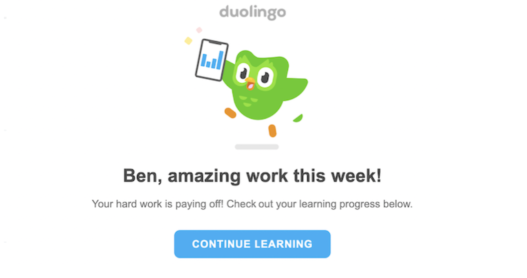
Consider the example below: the site uses reinforcement cues to encourage users to complete more lessons.

How to use choice architecture in product designs
Now that you know what choice architecture is and why you should use it, let’s take a look at how you can put it into practice.
1. Use social proof
One of the key principles of choice architecture is that we’re often influenced by what others do and the decisions they make. This is why social proof — like reviews, ratings, or testimonials — is so powerful in marketing.
By showing users that others have made a particular choice with good results (such as buying your product or service), you’re more likely to build trust and positively influence their decision.
We use this ourselves! Here’s some social proofing on the Backlog.com website.

(Image Source)
2. Offer a single choice
When given too many options, people tend to freeze up and have a hard time making a decision. This is why it’s often better to offer a single choice rather than multiple options.
For example, instead of asking your users to choose between different products, try offering a single product with different customization options. This way, users can still make a choice that’s tailored to their needs without feeling overwhelmed.
3. Use concrete and specific language
When you’re presenting choices to your users, it’s important to be as specific as possible.
This means avoiding technical jargon and using language that’s easy to understand. Instead of saying, “Choose your shipping option,” which is open-ended, you might say, “Standard shipping (arrives in 5-7 days) or express shipping (arrives in 2-3 days).” Users can more easily understand their options and make an informed decision.
4. Create a visual hierarchy
In addition to using specific language, visuals are essential in choice architecture. For one thing, they provide additional context that helps users understand their options. Another crucial factor is the arrangement of visuals in a design. By presenting some visuals more prominently than others, you can influence which options remain on a customer’s mind and guide their journey.
For instance, if you’re selling tickets to an event, you could use a seating chart to help users choose their seats. Or, when presenting subscription options, you can highlight the most popular choice to show users which option is valued among other customers.

5. Be clear about the consequences
When people are making a choice, they often think about the short-term consequences of their decision. But it’s also important to be clear about the long-term consequences as well.
Let’s say you’re offering a cheaper price for a limited time. Make it very clear that the price will go back up after this time period has passed. Transparency is an important part of treating customers fairly.
6. Use the categorization technique
One key principle of choice architecture is using categorization techniques to simplify the decision-making process for users. Consider how Netflix allows you to browse movies and TV shows by genre, making it easier to find something tailored to your interests. This technique is also useful on e-commerce sites, where products are grouped by category (e.g., women’s clothing, men’s clothing, etc.).
When using this technique, it’s important to research the user’s needs and preferences. On some e-commerce sites, you might want to offer categorization options by occasion rather than type. If you’re selling flowers, categories like “birthdays,” “weddings,” and “funerals” are more helpful. However, categories such as “pants,” “tops,” and “accessories” are better for a clothing site.

Overall, the key to successful choice architecture is understanding user goals and preferences and tailoring options accordingly. By being clear about the consequences of each choice and simplifying the decision-making process, you can increase conversions and boost sales.
7. Offer pricing packages
Offer different combinations of products or services at multiple price points. For example, a mobile phone company might offer a “basic” package with a limited data plan as well as an “unlimited” package with high-speed data.
There are several benefits to offering different pricing packages. First, it’s a great way to give users the flexibility to choose a plan that’s tailored to their needs.
Second, it can help simplify the decision-making process by providing users with clear options and making it easier for them to compare and contrast different plans. Finally, it can boost sales by encouraging users to opt for a higher-priced package. Why? Because when one price is sandwiched between a higher and lower one, people tend to go for the middle option.
8. Use nudges
We experience nudges every day. White lines on the road? These are nudges to remind you to stay in your lane. A 2-for-1 promo at the grocery store? These are nudges to buy more of a particular product. ‘Specials’ on a menu? The restaurant wants you to order these items because they’re more profitable, available seasonally, or have a short shelf-life.
Nudges are everywhere, and they’re often used to influence our behavior. In the context of choice architecture, you present information in a way that encourages users down a specific conversion path.
For example, e-commerce sites frequently send an email to nudge users to buy items they left in their online shopping cart. On travel sites, you might nudge users to book flights sooner rather than later by putting a time limit on the offer.
When using nudges in choice architecture design, it’s important to think about what type of behavior you want to influence. Consider things like the wording, color, and placement of your nudge as well as triggers, such as clicking on a specific button or entering an estimated travel date.
Here are some examples of digital nudges:
- A “Buy Now” button that appears after a user adds an item to their shopping cart
- An email prompting users to book their flights before prices go up
- A banner ad encouraging users to sign up for a free trial of your service
- Automated messages of encouragement, like “Great job!” or “Just 2k more to go!”
- Automated reminders to donate, exercise, or keep practicing
- Suggested passwords that offer better protection
- A default opt-in message that encourages you to automatically enroll
- Special offers that motivate users to make a specific purchase or time-sensitive decision
The ethics of nudges
Choice architecture is a hotly debated topic: do nudges count as coercion?
Libertarian paternalism is a philosophy that combines free-market economics with the belief that people should have as much freedom as possible to make their own choices, within the bounds of reason. In the context of choice architecture, libertarian paternalism relates to using nudges and other techniques to influence behavior without infringing on the user’s freedom of choice.
Critics of this approach argue that nudges and other forms of choice architecture are unethical, as they can be coercive or manipulative. The concern is that choice architecture could exploit a user’s lack of knowledge. Others counter that such ethical concerns are often overblown and don’t take into account the potential benefits of nudges, such as increasing engagement and usefulness or reducing the cognitive load on users.
The debate over the ethics of choice architecture will continue to be a controversial one, and opinions are likely to remain divided. However, given the growing interest in this area of design and psychology, it’s important to carefully consider both the intended outcomes and potential risks associated with using nudges and other techniques in your own designs.
Ultimately, if you remember to put users first and treat them fairly, you’ll stay on the right side of this debate.
How to use nudges in your designs
If you’re interested in using nudges in your own designs, there are a few things to keep in mind.
Here are a few tips:
- Define the behavior you want to influence.
- Consider the potential risks and benefits of using a nudge before implementing it.
- Test nudges on real users to see if they actually have the desired effect.
- Be sure to consider the ethical implications of your nudges.
- Use diagramming tools to help you map out the customer journey and spot potential places to insert choice architecture.
Choice architecture, and you
At the end of the day, choice architecture isn’t about controlling users. It’s about making their user experience as simple, straightforward, and satisfying as possible. By using social proof, offering fewer choices, and being clear about the consequences of their choices, you can design products and experiences that serve the needs of your users and your organization. The end goal? More conversions for you and a better experience for your users. Win-win!


