As the use of smartphones rises globally, apps continue to be big business. But there’s a lot of competition, and user expectations are higher than ever. They want a product that not only functions seamlessly but offers an attractive interface and a good user experience. Needless to say, you can’t simply throw together a product that looks cool and hope for the best. Good mobile app design takes a great deal of thought and planning.
According to a 2018 Adjust study, on average, mobile apps get deleted 5.8 days after they’re last used. Clearly, people have no qualms about uninstalling apps. So, how do you make sure yours doesn’t end up in the digital trash bin? Know your audience, and provide the best user experience possible. It’s no easy task, but here are the top best practices you need to know for any great mobile app design.
Optimize user flow
The user flow refers to how users engage with the app from the moment they open it to the minute they close it. Good user flow gets the user to the finish line, whether that’s a purchase, a subscribe button, or a primary function of the app. Poor user flow cuts their journey short, motivating them to leave before completing the intended action.
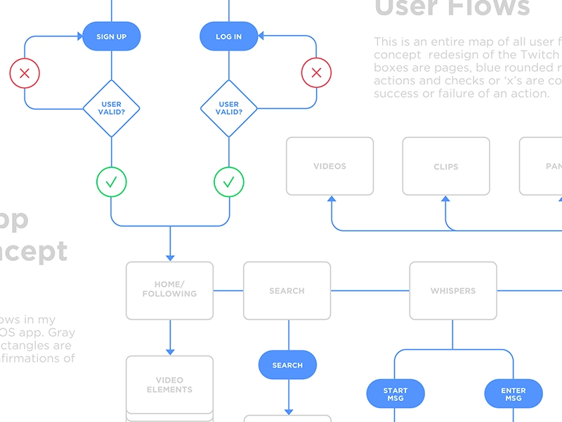
The latter scenario can happen for a number of reasons. Imagine trying to find your way through a complicated home screen or dealing with constant freezing and lag. When users hit their frustration threshold, they move on or uninstall the app altogether. Friction points can occur in any area of the app, so it’s important to identify and address them.
Fixing the user experience isn’t always easy. When you’re working closely with something you designed and know its intended purpose, you might be blind to the problem areas. Try applying these four approaches:
1. Break tasks into chunks
Whether you’re running a marathon or filling out an online form, it’s helpful to know where the endpoint is so you can pace yourself. When it comes to mobile app design, chunking is a popular method for dividing big tasks into a series of smaller ones.
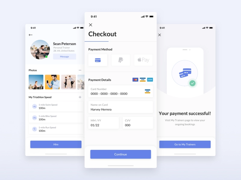
For example, at a store’s checkout, the payment process is often broken down into a series of four or five stages. This improves customer comprehension and patience because they have an idea of how long the task will take. It’s especially important when leading your user through tedious tasks.
2. Use data
Use customer data to make app interactions easier. Consider the example of Uber, which uses your geolocation to show you nearby drivers (and guide your selected driver to you). This means the user only has to select a pickup location, creating a faster, more convenient experience.
3. Make it intuitive
Make sure each step in the process is logical and clearly signposted with a weighted design that leads the user onto the next stage. Draw up a wireframe (either by hand or via diagramming software) to see the user path more objectively and help visualize the process as a whole.
4. More is less.
Too much choice is proven to increase anxiety and decrease satisfaction, so keep it simple and prioritize one action per page. Again, use design to guide the user towards this desired action with calls to action (CTA) highlighted in large buttons and contrasting colors.
Customize mobile app design for each platform
Android and Apple iOS have individual design standards, resulting in a different user flow. Users have specific expectations of how each app environment should work, so you can’t use these designs interchangeably.
Make sure you have a thorough understanding of best practices and create app wireframes and prototypes that are consistent with the controls and aesthetics of each platform.
Keep it simple, stupid
The journalistic principle Keep It Simple, Stupid (KISS) is key during a user’s first few moments interacting with an app. Mobile UI designs that present too many options, icons, and buttons increase cognitive load, which is an instant turn-off.
Keeping things simple and clutter-free is far more enticing and will encourage users to stick around. It’s part of the reason Apple is so successful: simplicity.
A clean, minimal interface is especially important for mobile devices, where screen size is limited. To make the best use of space, break each step down into separate pages. Only show users the information and details they need to make a decision on that particular page.
Don’t restrict the app with social logins
Not everyone loves the idea of linking all their apps to social media accounts. One surefire way to drive away a chunk of your audience is by using social logins — a growing trend.
Social logins require users to sign in with credentials from social media or email accounts. Users often have concerns about how the data is used, making them wary of linking accounts. Another problem? Many people either don’t have social media accounts or use them infrequently and don’t want their data being shared this way.
So, do yourself a favor and make the registration process as accommodating as possible. Provide multiple sign-in options, and if you do include social logins, include a brief explanation of how it benefits the user experience.
Simplify the navigation
Make your navigation menu helpful, easy to find, and constantly visible. Always tell the user where they are and show them where they can go.
Moreover, when choosing a navigation pattern, go with something familiar, such as the hamburger menu. Implementing an instantly recognizable design means users will know straight away how it works.
Create menus that users can conveniently hide when not in use. This results in a cleaner design, less clutter, and more space for completing an intended task.
Make everything obvious
When you’re on a desktop, your cursor usually changes from an arrow to a pointing hand when you hover over something clickable. You don’t have this same function on a mobile app, so make it obvious to the user which elements they can click on. Again, use design here to make clickable things stand out — either with shadowing, buttons, or contrasting colors.
Create a finger-friendly interface
As a UI/UX designer, it’s tempting to make elements smaller when you don’t have much screen space to play with — but that would be a mistake. You need each element to be big enough to tap (aim for something between 7 mm and 10 mm). Also, avoid bunching too many buttons together, so the user doesn’t accidentally hit one while aiming for another.
Know your thumb zones
Think about how you hold your phone. The first third of the screen is easy to reach with your thumb. The second third is a little more of a stretch, and the last third is difficult or impossible if you have small hands and/or a large device.
Take this into account when designing for mobile. Place frequently tapped icons and CTAs in the green zone and destructive items (such as ‘delete’) in the red zone. That way, users won’t accidentally tap them.
Make it multichannel
Users switch between app and desktop, so make that transition seamless. For example, users shopping for clothes on their mobile device might add items to their basket on their phone and then complete the computer transaction. Make sure those same items are saved in their cart, whatever the device.
Use skeleton screens
Waiting for something to buffer or load can be frustrating. Rather than showing the user spinning dots or a load bar, give them a skeleton screen, which is basically a version of the page that shows where the information will soon appear. This helps them focus on progress, rather than waiting.
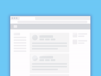
You should also use animation when pages are loading to let the user know the app hasn’t frozen. This can be as simple as a pulsing box or a color change. Visual signs of progress give the user a sense of control and minimize any frustration they may be feeling. Of course, doing everything you can to keep your page load times down is also a must.
Avoid dead ends
An empty state (aka a zero state) is where your user gets an error message. Rather than just telling them ‘something went wrong,’ provide more information about the exact issue and how they can fix it. Offering a solution lowers frustration levels and makes the user feel more in control.
You can also use it as an opportunity to entertain. Flickr has a great error screen: it’s informative, on-brand, and makes you smile, even if you don’t have what you need.

Make it personal
From greeting someone with their name to remembering their preferences, make the most out of your available user data. Not only does it provide the information the user needs more quickly, but it also makes the interaction feel more genuine.
Surprise and delight
Like the Flickr error screen, when we see something that goes above and beyond what’s expected, it entertains us and makes us feel valued. Delighting users with quirky functions, animations, and even unusual color choices makes the experience pleasurable and helps create an emotional connection between you and your audience.
Reveal features at a gradual pace
Deliver a positive user experience by gradually introducing new information when it benefits the user. App designing depends on a delicate balance of anticipating a user’s immediate needs and knowing when to wait and let them discover more on their own.
Resist the urge to bombard users with a lot of feature tutorials upfront. Make the onboarding process smooth and unobtrusive by only explaining the most fundamental features at the beginning. Based on the data from your user stories, you’ll know the most common reasons why people initially download the app and can design for these user goals.
For less prominent features, design your app to trigger descriptive labels or tutorials only when the user explores specific pages on your app. That way, they won’t see the information until they need it and are more likely to be receptive.
Make your notifications count
According to one report, annoying notifications are the #1 reason people uninstall apps. But even if they don’t uninstall your app, sending too many push notifications in a short amount of time will lead to something called notification overkill.
Notification overkill is when a user stops responding to the information they receive and clears it without reading. To get around this, consider bundling your info in one notification. Make sure the information is relevant. And send it when users will be awake and on their phones.
Final thoughts
When a design is good, it’s seamless: the user is able to use the app without being aware of the interface. Achieving this zen state is often a process of trial and error, but the tips above will give you a leg up in getting there. Combine this advice with plenty of research, personal experience, and design tools to help make the wireframing process easier, and you’ll be well on your way to creating an app that lasts.
This post was originally published on August 7, 2019, and updated most recently on January 8, 2022.
About Author
Georgina Guthrie
Guest authorGeorgina is a displaced Brit currently working in France as a freelance copywriter. Before moving to sunnier climates, she worked as a B2B agency writer in Bristol, England, which is also where she was born. In her spare time, she enjoys old films and cooking (badly).


