Great design is like a great story — exciting, engaging, and compelling. It has the power to change people’s minds, open their eyes to new possibilities, and inspire them to take action in the world around them. But, what essential elements make up a truly successful design? Is it science? Chance? Talent? A little of all three?
Mostly, it’s about understanding the 10 basic elements of design and how to use them to create amazing results. Read on to find out what they are!
1. Line
Lines are everywhere in design. You can use them to divide space, direct attention, create movement, and define shape. Lines can be thick or thin, straight or curved, horizontal or vertical. And while there are an unlimited number of line variations, you should be aware of these three basic types: straight, curved, and diagonal.
Straight lines are most common and are useful for creating a feeling of stability and order. Curved lines can create a sense of fluidity and movement, while diagonal lines can create tension and excitement.
2. Point
A point is the simplest type of line and is used to create basic shapes like squares and rectangles. Points are also the building blocks of more complex shapes, which you can make by linking points together. In design, points are often used to create visual interest or direct attention to a particular area.
3. Shape
Shape refers to the two-dimensional outline of an object. Designers develop a shape by combining points and lines; the flat shape is usually seen from one side.
In graphic design, UX design, and visual design, artists work with a variety of realistic and abstract shapes, each with its own unique properties and purposes. The most common shapes include squares, circles, triangles, and rectangles.
The straight lines and boxy structure of squares and rectangles make them ideal for representing stability and order. At the same time, the roundness and continuity of circles create a sense of relaxation, fluidity, and wholeness. Triangles can evoke a sense of power and aggression, while organic shapes are more useful for representing naturalness, comfort, or simplicity.
4. Texture
From a design standpoint, you can divide texture into two categories: tactile and visual. Tactile texture is the type we can feel, while visual texture is the type we see. When it comes to graphic design, we’re talking about the latter.
Texture is how a surface ‘feels’ — which might sound a bit odd when talking about an image on a page or computer screen. Yet, visual texture is an important element of design, and when used the right way, it creates a variety of dramatic effects.
For instance, visual textures can give a flat surface the appearance of depth or make a smooth image look distressed, glittery, or rocky.
5. Color
Color is one of the most important elements of design, and it has a huge impact on how viewers interpret a visual aesthetic. Choosing the right color sets the mood, creates contrast, and adds visual interest to make designs more pleasing to the eye.
You can apply color as a solid block or layer it as an element of patterns, shading, and textures. It’s also useful for conveying information, expressing emotion, and highlighting key elements.
Colors may be warm or cool, light or dark, saturated or muted. And each color has its own unique properties, which you should take into consideration when using it in your product designs.
What to consider when using color
Color creates a mood and tells a story — both in its own right and as an element of a brand identity. Here are some key terms related to color that you need to know.
- Hue: the hue refers to a particular wavelength of color. There are an unlimited number of hues, but some of the most common include red, orange, yellow, green, blue, and purple.
- Saturation: when it comes to color, saturation is one of the most important properties to consider. Saturation is the intensity or purity of a color and refers to the brightness or intensity of the hue. A highly saturated color is very bright, while a low-saturation color is muted and washed out. You can use higher saturation to evoke more intense emotions and contrast darker and softer colors, while low saturation can be used to evoke a more calm, restrained, or somber aesthetic.
- Value: value is the lightness or darkness of a color. It’s created by adding white or black to a color, and it’s usually measured on a scale from 0 to 100. The higher the value, the lighter the color. Changing the value of a color is helpful when adding depth and dimension, creating dramatic contrast, or accentuating certain elements.
6. Typography
Words are important, but how they look is equally so. As with color, texture, and shape, the typography you choose can tell a story, make a statement, create a sense of movement, and much more.
Typography refers to the shape, style, and arrangement of text. How you present text can tell your viewer whether you’re playful, professional, traditional, or creative or differentiate a high-end food store from a quirky knitting blog.
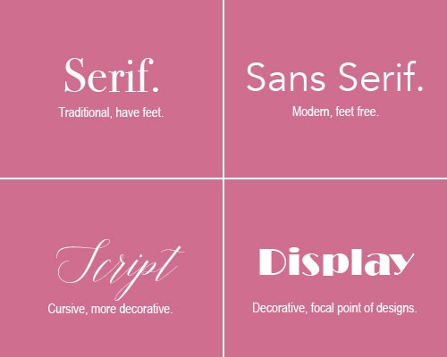
In graphic design, we create entire sets of text with the same typeface design, known as a font. Sans-serif fonts are often used for body text because they’re easy to read, while serif fonts are commonly used for headings and titles. Script fonts are perfect for adding a touch of elegance, while display fonts are ideal for making a bold statement.
Fonts
As well as evoking a specific tone, typography can help to create visual hierarchy in a design. Headings and subheadings, for example, help to break up large blocks of text and make your content easier to read. Using fonts of different sizes also tells the reader which information is most or least important, so they’re more likely to remember key details.
Here are some key typography terms you need to know:
- Serif: this font style contains small strokes at the top or bottom of each letter, making it easier to read at large sizes. Serif fonts are considered more traditional and serious (e.g., Times New Roman), and you’ll often find them in formal documents and newspapers.
- San-serif: these font styles don’t have extra strokes at the top or bottom of letters, giving them a simpler, more modern look. Sans-serifs are easier to read in body text, making them perfect for conveying information in a clear and concise way.
- Script: script fonts resemble human handwriting, especially cursive. They add a touch of elegance, making them ideal for invitations, business cards, and other formal communications.
- Display: a display font is highly creative or decorative and features visually unique styling or placement. Since they’re meant to be dramatic, these fonts are perfect for headlines, posters, branding, and other attention-grabbing materials.
7. Balance
Balance is the distribution of visual weight in a design. In any design project, the goal is to create a sense of order and equivalence, ensuring all design elements work together well. There are three types of balance — symmetrical, asymmetrical, and radial.
Symmetrical balance occurs when the elements on one side of the design mirror those on the other side. Asymmetrical balance is when the two sides of the design are different, but they complement one another and equally create visual interest. Radial balance refers to a design with elements evenly distributed around a central point.
8. Harmony
Whether you’re designing a landing page, a display ad, or a mobile app, harmony is key. Harmony is when all the elements in a design work together to create a pleasing whole. If this doesn’t happen, it can feel jarring for the viewer.
Contrast is a key part of achieving harmony: it can direct the viewer’s attention to important elements or produce an effect that’s pleasing or intriguing to the eye. Color, scale, layout, and typography are all techniques you can use to create and manipulate contrast.
9. Scale
Scale is an often overlooked but extremely important aspect of design. The scale refers to the size of a specific element in relation to other parts of the design.
When used correctly, scale can convey movement and depth; add emphasis and interest; and create harmony, rhythm, and balance. Another benefit is its ability to influence how we perceive the overall size, prominence, and importance of content in the design. For example, placing a large shape next to a small shape will make the smaller shape appear to be farther away.
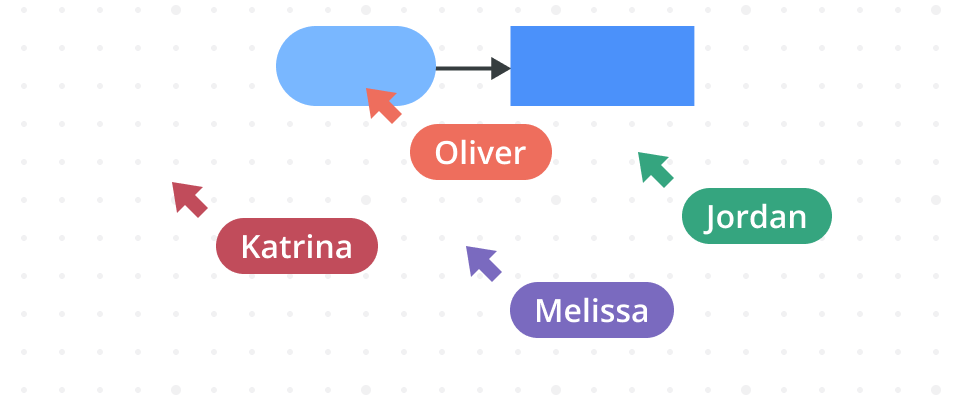
10. Space
Space is the area around, between, and within objects. It can be positive or negative, open or closed, two-dimensional or three-dimensional. Designers use space to create balance, hierarchy, scale, and more. In a two-dimensional design, you can use shadows, overlapping, and sizing to create the illusion of three-dimensional space.
Space can be used to do the following things:
- Enhance readability: by giving the eye somewhere to rest, space improves readability and legibility.
- Lead the eye: space helps to direct the viewer’s attention to what’s important in a design.
- Create movement: by using negative space creatively, you can create the illusion of movement in a static design.
- Create depth: by using different levels of space, you can create the illusion of depth in a two-dimensional design.
- Separate elements: space can separate different elements in a design, making it easier for the viewer to understand what’s going on.
- Add a feeling of luxury: in the world of luxury, less is more. Using space effectively can add elegance to a design.
Final thoughts
There you have it — the 10 basic elements of design! By understanding and using these concepts, you can develop appealing designs that help to achieve your business goals. So, experiment, play around, and see what you can come up with.
One last tip? Diagramming software can be a big help when sketching out your initial designs: it’s a great way to get a feel for the layout and balance of elements. Plus, with handy templates and a drag-and-drop interface, it’s easy to get started in seconds.
When choosing a diagramming tool, opt for a cloud-based one, so you can collaborate with remote teams in real time. It’s also helpful to have version control to create and archive as many designs as you like without losing track. That way, you can focus on your creativity and experiment to your heart’s content.
About Author

Georgina Guthrie
Guest authorGeorgina is a displaced Brit currently working in France as a freelance copywriter. Before moving to sunnier climates, she worked as a B2B agency writer in Bristol, England, which is also where she was born. In her spare time, she enjoys old films and cooking (badly).