Imagine you’re going to build a house. Before you start picking out wallpaper and plants for the garden, you’ve got to figure out where the rooms are going, where you’re putting doors, and how everything links up.
This is exactly what a low-fidelity wireframe does for a digital product: It helps UX design teams work out the structure and flow of an app or website, free from distracting design elements. Let’s take a closer look at what they are and when to use them.
What is a low fidelity wireframe?
A low fidelity wireframe (aka a lo-fi wireframe) is essentially a rough sketch of a website or app. It shows you the basic structure, and that’s about it. Bare bones and nothing more.
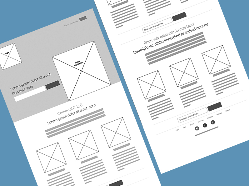
Visually, they consist of simple lines, shapes, and placeholder text. Don’t stress about fonts, colors, and so on at this point — your primary goal here is to map out the core layout and the placement of key elements like buttons, headers, footers, and navigation menus.
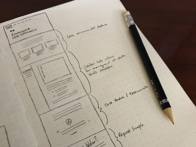
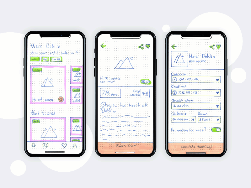
Low fidelity wireframes can be digital or hand-drawn, as this example from Tim Knight shows.
TL;DR: Low-fi wireframes are the first step in visualizing your design. They’re quick and get ideas flowing without the team and clients getting bogged down by details. This helps everyone grasp the fundamentals early on.
What are the benefits of a low-fidelity wireframe?
Here’s why they’re such an essential first step.
Ease and speed
The biggest benefit is ease. Since you’re not focusing on aesthetic details, you can whip the visuals for an app or site in no time. This means you can gather feedback sooner, try out ideas, and make changes without feeling like you’ve invested a ton of time on something that might need a complete overhaul.
Great for communication
Clients famously don’t like surprises, so involving them early on will only ever be a good thing. Low-fi wireframes are also simple enough for everyone to understand, making them a great communication tool in themselves. Better still, because they’re quick to make, you can share them early and often, getting lots of feedback during those crucial first stages. This saves everyone headaches down the line since it’s much easier to tweak a basic layout than to argue over a finished design.
Help you focus on usability and functionality
By stripping away the details, you can concentrate on the core structure and flow of your project. This helps you hone in on potential issues with navigation and user paths before you get too far along in the process. Plus, it’s much easier to tweak a color or image than to overhaul a site layout, so the time investment during this stage really does pay off.
More objective feedback
People tend to feel happier giving honest feedback and suggesting changes when they’re critiquing something that isn’t polished. There’s less attachment to a rough sketch than to a detailed, finished design, which means you can get more open, constructive input from your stakeholders.
Cost-effective
Spending less time on detailed designs means spending less money on the initial phases of the project. This is especially useful for startups or small teams working with limited budgets. There is lots of progress without the big cash spend.
What does a low-fidelity wireframe include?
Simple? Yes. But there are still some elements you need to include.
- Basic layout structure: This is the backbone of your wireframe, showing where all the major parts will go.
- Placeholders for key elements: These mark where components like headers, footers, navigation bars, buttons, and content areas go. They’re typically represented by simple boxes or shapes.
- Navigation elements: These give a sense of how users will move through your site or app.
- Dummy text and images: You’ll use placeholders for text (like ‘Lorem ipsum’) and images (like blank boxes with an ‘X’ through them) to show where content will eventually sit. This keeps the focus on layout rather than distracting details.
- Annotations: They should be simple, not oblique. When more context is needed, add brief notes or labels to explain the purpose of certain elements.
- Basic interaction elements: It’s helpful to show interactive elements like buttons and links, even in low-fi wireframes. Use simple labeled shapes.
What does a low fidelity wireframe not include?
Knowing what to keep out is as important as knowing what to keep in.
- Detailed design elements: It’s all about the structure, not the visual styling. This means no colors, fonts, photography, fancy graphics, and definitely no high-res imagery.
- Precise spacing and alignment: You want to give a rough sense of where things go, not finalize their exact positions. So don’t worry about pixel-perfect placement just yet.
- Branding elements: Logos, brand colors, and specific brand imagery are usually left out. We’re focusing on functionality, not brand identity at this stage.
- Interactive details: While basic interactive elements like buttons and links make an appearance, you won’t see detailed interaction designs like hover effects or transitions.
- Content specifics: No finalized text, images, or multimedia content.
- High-fidelity graphics: Any high-res images, icons, or detailed illustrations are left out.
The limitations of a lo-fi wireframe
Simplicity brings benefits, but there are limitations to bear in mind. It’s important to understand what they are, and when it’s time to move to a high fidelity wireframe.
While low-fi wireframes are great for planning and ideation, they do lack visual detail. This makes it trickier to get the look and feel of a product. For this reason, they’re not suitable for detailed user testing since users might struggle to give accurate feedback on a design that lacks visual and interactive elements.
It’s also to misinterpret them because they’re so basic. This has the potential to stir up confusion, leading to misaligned expectations between the design team and stakeholders.
Low-fi wireframe vs. high-fi wireframe: when should you use each one?
First, let’s take a look at the differences.
| Low-fidelity wireframe | High-fidelity wireframe | |
| Detail level | Basic, focuses on structure and layout | Detailed, includes design specifics and aesthetics |
| Design elements | Simple shapes, lines, and placeholder text | Real images, colors, fonts, and detailed graphics |
| Creation time | Quick to create | Takes more time due to detail |
| Purpose | Early-stage planning, idea exploration | Finalizing design, detailed user testing |
| User interaction | Limited to basic navigation and buttons | Includes detailed interactions and animations |
| Feedback | Useful for initial feedback and brainstorming | Suitable for detailed feedback and usability testing |
| Client presentation | Good for initial concept presentations | Ideal for final presentations and approvals |
| Content specificity | Uses placeholders for text and images | Contains actual content or close approximations |
| Adjustability | Easy to change and iterate | More effort required to make changes |
| Focus | Layout and functionality | Visual design and user experience |
| Usage stage | Early in the design process | Later in the design process |
| Tools used | Simple tools like paper, whiteboards, or diagramming software | Advanced design tools like Sketch, Figma, or Adobe XD |
| Cost | Low cost | Higher cost due to time and resources required |
Should you use a low-fidelity (lo-fi) or high-fidelity (hi-fi) wireframe? It all depends on where you are in the design process and what you need to achieve.
Low-fidelity wireframe: When to use it
- Early in the design process: Lo-fi wireframes are ideal for the initial stages of a project. They help you map out the basic structure, share ideas, and get quick feedback.
- Exploring concepts: When you need to explore a range of layout options or user flows, lo-fi wireframes help you iterate fast without too much up-front resource investment.
- Communicating with the team: They’re great for discussing ideas and making sure everyone’s singing from the same hymn sheet.
- Client presentations: Lo-fi wireframes offer a clear, uncomplicated view of the layout and functionality without overwhelming or distracting clients with superfluous information. This is especially useful during the early stages of the project.
High-fidelity wireframe: When to use it
- Later in the design process: Use high-fi wireframes once you’ve finalized the overall structure and need to dive into the details.
- Detailed design and development: When you need to specify exact design elements like colors, fonts, images, spacing, and so on.
- User testing: They offer a more realistic representation of the final product, making them better suited for in-depth user testing.
- Final presentations and approvals: Hi-fi wireframes are perfect for final presentations to clients or stakeholders when they need to understand the feel as much as the function.
From low-fi to high-fi to finished: This wireframe GIF by Marko Peric, which shows the whole process in action.
Low-fidelity wireframe templates
Templates make the process easier and faster. Simply choose one as a starting point, then customize it.
Why use templates?
- Save time: Templates give you a pre-defined structure, so you can quickly sketch out your ideas without starting from scratch each time.
- Better consistency: Templates help you keep a consistent layout and design approach across different projects or pages.
- Boosts collaboration: Having standardized templates to hand makes it easier for the team to contribute to the wireframing process. It also means everyone’s output is formalized, since they’ll all be using the same tool for the mockups. Plus, if you’re using a cloud-based tool like Cacoo, you can invite others in to edit and comment in real time.
- Simplify communication: Templates offer a clear and familiar format, which means stakeholders can take in the information faster, without getting distracted by new visuals each time.
Why you should use Cacoo for your low-fi wireframes
Cacoo’s huge library contains all the wireframe templates you could ever need. Whether you’re designing for Android or IOS, creating a social media app or a brand new website — just select the one you want, then customize with a click thanks to its easy drag-and-drop interface.
When you’re done, share it with the design team and stakeholders thanks to a range of access options. They can edit and comment in real-time, so the whole process from wireframe to finished product is seamless and collaborative. Ready to take Cacoo for a spin?
About Author

Georgina Guthrie
Guest authorGeorgina is a displaced Brit currently working in France as a freelance copywriter. Before moving to sunnier climates, she worked as a B2B agency writer in Bristol, England, which is also where she was born. In her spare time, she enjoys old films and cooking (badly).