Imagine you’re a business owner. You’ve recently launched a new project, and naturally, you want to see how well it’s getting on. Are teams hitting milestones? Is the pace good? Are there bottlenecks? Rather than getting lost in a sea of numbers and lengthy progress reports, you’d prefer a simple visual representation, right? Enter the burn-up chart.
What is a burn-up chart?
A burn-up chart is a graphical representation of work completed over time.
Think of it like this: If your project goal was to open 10 new stores across the country in a year, a burn-up chart would plot each store’s opening against the timeline, giving you a bird’s eye view of how you’re doing. As you open each store, the graph climbs, showing progress towards your goal.
The x-axis (horizontal line) represents time — this could be in days, weeks, sprints, or whatever unit is relevant to your project. The y-axis (vertical line) represents the amount of work — this might be in terms of features developed, tasks completed, stores opened, or any measurable unit of progress.
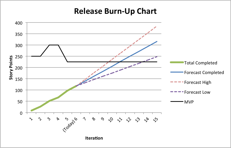
An example of a burn-up chart, via robfroham.com
What is the burn-up chart in Agile project management?
Welcome to the world of Agile project management, where charts, graphs, and visuals play a starring role in steering a project to success. In the context of Agile, a burn-up chart tracks the amount of work completed in each sprint against the total scope of work.
Let’s take a tech startup as an example. Suppose they’re developing a new app with 100 features. With each sprint, as the development team completes features, they mark it on the burn-up chart. By the end of Sprint one, if they’ve completed 10 features, the chart will show a line rising to the number 10 on the y-axis.
But there’s an additional layer here. Agile projects are dynamic, and sometimes, as the project progresses, new features or tasks might be added based on customer feedback or unforeseen requirements. The burn-up chart captures this change in scope.
So, if our tech startup decides to add 10 more features after Sprint two, the total scope line on the chart moves up, indicating a change.
This real-time tracking and ability to accommodate changes make the burn-up chart a favorite in Agile circles. It’s like a progress bar that not only shows you how much you’ve done but also adjusts itself when you decide to add a bit more to your plate.
Essentially, within the Agile framework, the burn-up chart serves as a clear visual indicator of:
1. How much work has been completed in each sprint.
2. How the team is progressing towards the overall goal.
3. Any changes in the scope of work and how they impact the project’s trajectory.
The difference between a burn-up chart and a burn-down chart
Picture this: you’re overseeing the construction of a new office building. Your goal is clear: complete the building by a certain date. So how do you track your progress?
Using a burn-up chart
Think of the burn-up chart as monitoring the construction progress floor by floor. As each floor gets built, your progress line rises.
If, during the process, you decide to add two more floors (maybe for that rooftop cafe you just realized you wanted), the total floors’ line also rises. Essentially, the burn-up chart shows work completed, plus any additions to the overall scope.
Using a burn-down chart
Instead of counting up what’s been done, it counts down what’s left. Using our building analogy, imagine starting with the total number of floors you need to construct. As each floor gets completed, you subtract it from the total. Your chart then ‘burns down’ to zero as you approach your goal.
If new work gets added (remember that rooftop cafe?), the line doesn’t climb up as with the burn-up chart; instead, it takes longer to burn down.
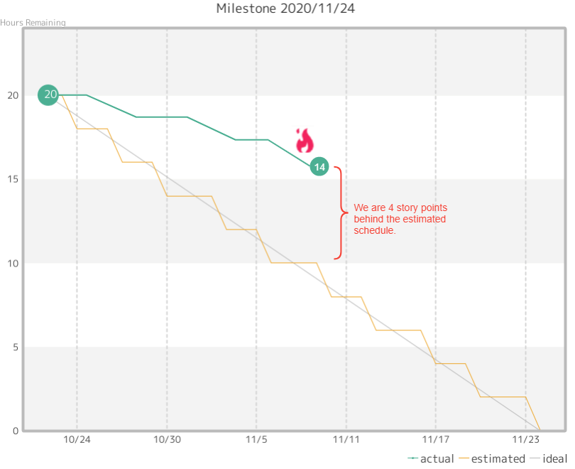
Burndown chart created in Backlog
So, what are the main differences?
1. Direction of progress: A burn-up chart shows work accumulating over time, while a burn-down chart displays work decreasing as tasks get completed.
2. Scope changes: In burn-up charts, if the project scope changes (like adding more tasks or features), the total work line adjusts upward. In burn-down charts, when scope increases, it merely makes the chart take longer to reach zero.
3. Visual perspective: Burn-up charts can be seen as a more optimistic visualization, showing what’s been accomplished. Burn-down charts, on the other hand, focus on what’s left, which some argue provides a clearer perspective on potential overruns or delays.
In the grand scheme of things, whether you choose burn-up or burn-down boils down to preference and the specific nature of your project. Some businesses find solace in seeing how much they’ve accomplished (burn-up), while others like the clarity of knowing what’s left to tackle (burn-down).
Benefits of using burn-up charts
While both burn-up and burn-down charts have their place in the world of project management, there are specific advantages to using a burn-up chart that might tilt the balance in its favor, especially in certain contexts. Let’s delve into why some businesses prefer to watch their progress ‘burn up’ rather than ‘burn down.’
1. Clearer visualization of scope changes
Imagine you’re managing a product launch, and halfway through, the marketing team realizes they want to add three more promotional activities. With a burn-up chart, this addition becomes a visible change in the total work line, making it crystal clear to stakeholders that the project scope has expanded. This immediate visual feedback helps everyone stay on the same page.
2. Positive reinforcement
Let’s face it; we all like to see growth. Watching a line climb as tasks are completed can serve as a motivational boost. It’s like watching the revenue graph of a successful sales campaign — there’s an innate satisfaction in seeing things go up. The psychological aspect shouldn’t be underestimated, either; teams often feel more accomplished seeing how much they’ve achieved (aka the ‘gain’), rather than focusing on what’s left (aka the ‘gap’).
3. Distinct separation between work done and total scope
Burn-up charts split the completed work and the total work into two distinct lines. This makes it easier to understand the team’s pace and how it relates to the overall goal. For example, tracking monthly sales targets vs. the annual goal. Both are important, and having them separate allows for a more nuanced understanding of progress.
4. Flexibility in dynamic environments
In industries where change is the only constant (think tech startups or fast fashion), the burn-up chart shines. It seamlessly accommodates scope changes, making it easier to adapt and re-strategize. It’s like a retailer adjusting their stock based on real-time sales data — staying flexible and informed is key.
5. Improved stakeholder communication
When presenting to stakeholders, especially those not deeply entrenched in daily operations, clarity is paramount. A burn-up chart gives you an unambiguous view of where the project stands, any changes that have occurred, and the trajectory moving forward. It’s clear, concise, and with no room for misinterpretation.
How do you read a burn-up chart?
Having a burn-up chart is one thing, but being able to interpret it accurately is the real game-changer. Reading a burn-up chart isn’t rocket science, but a bit of guidance never hurt anyone. Here’s how you can decipher the story it’s trying to tell.
1. Understanding the axes
First things first, get familiar with the x and y axes. The x-axis typically represents time — whether that’s days, weeks, sprints, or even months. The y-axis, on the other hand, signifies the amount of work, which could be tasks, features, or any unit relevant to your project.
So, in the sales world (as an example), the x-axis represents the months of the year, and the y-axis indicates the number of units sold.
2. The completed work line
This line plots the cumulative work completed over time. As your team progresses and ticks off tasks, this line will rise.
3. The total work line
This line represents the entire scope of work for the project. In a scenario where the scope doesn’t change, this line would remain flat. But if new tasks or features are added, you’d see this line shift upwards.
Picture a production target in a factory. If halfway through the month, a big new order comes in, the production target for the month goes up. The total work line reacts in the same way.
4. Gap between the lines
The space between the completed work and total work lines represents the amount of work remaining. The closer these two lines are, the closer you are to completing your project.
Think about a fundraising goal. If you’re trying to raise $10,000 and you’ve raised $7,000 so far, the gap represents the remaining $3,000.
5. Spotting scope changes
Anytime the total work line jumps upwards, it indicates that the scope of the project has expanded. This visual cue helps stakeholders and teams understand and account for project changes.
It’s like setting a budget for a department and midway through the year, deciding to allocate more funds for a new initiative. The original budget line would need an upward adjustment to account for this addition.
6. Assessing project health
If the completed work line is steadily rising and keeping pace with the timeline on the x-axis, it suggests things are on track. But if progress stagnates and the line flattens, it could be a sign of issues like bottlenecks.
When should you use a burn-up chart?
Burn-up charts are undeniably handy, but like any tool in business, timing and context are everything. So, when is it most fitting to whip out this chart and start plotting?
1. When you anticipate scope changes
If you’re heading into a project already expecting the scope to evolve — perhaps due to the nature of the client, the industry, or the project type — then a burn-up chart should be your go-to. It handles scope changes gracefully, visually showcasing these alterations.
Real-world example: It’s like a restaurant tweaking its menu based on seasonality. As you add or remove new dishes, the overall offerings change, but regular diners can still track what’s available.
2. For longer projects with multiple phases
Projects that span several months or even years, with multiple phases or milestones, can benefit from the cumulative representation of work that burn-up charts provide.
Real-world example: Think of constructing a skyscraper. As each floor gets built, it’s easier to track the total floors completed against the planned number of floors.
3. When the team needs a motivational boost
If the team is feeling the weight of a long-haul project, the upward trajectory of the completed work line on a burn-up chart can serve as a motivating visual reminder of how far they’ve come.
Real-world example: Think of a salesperson inching closer to a year-end bonus. Each deal closed takes them a step further, and visualizing this progress can be a real motivator.
4. In environments demanding transparency
If you’re working with stakeholders, team members, or clients who value transparency and consistent communication, the burn-up chart’s clear delineation of completed work versus total work is a boon.
Real-world example: Think of a company’s public quarterly earnings report. Investors can see revenue, profit, and forecasted numbers transparently, helping them feel informed and confident.
5. When dealing with complex projects
For complex projects involving multiple teams or departments, a burn-up chart simplifies the visualization process, providing a snapshot of the overall project health without getting bogged down in the minutiae.
Real-world example: Imagine coordinating a large corporate event. Different teams handle catering, logistics, marketing, and more. A collective chart showing overall progress can be invaluable.
6. When historical data is important
If you intend to reflect on past projects to forecast future tasks or to continually improve processes, the cumulative nature of burn-up charts makes them ideal repositories of historical data.
Real-world example: It’s similar to tracking annual company sales. By observing trends from the past five years, it’s easier to predict and strategize for the next five.
7. For projects with variable team sizes
If your project sees team members rotating in and out, or if you have variable team sizes across different phases, the burn-up chart will accommodate this variability without skewing the representation of progress.
Real-world example: Consider a manufacturing plant that sometimes employs seasonal workers during peak demand. The overall production output is tracked consistently, irrespective of the workforce size.
Who should use a burn-up chart?
Burn-up charts aren’t just exclusive toys for high-flying project managers or agile coaches. Their utility stretches across different roles and sectors within an organization.
1. Project managers of all stripes
These folks are essentially the captains of the ship when it comes to navigating the choppy seas of project execution. Burn-up charts give them a clear view of where the project currently stands, how much work remains, and if they’re on course to meet their destination on time.
2. Dev teams
For the individuals actually doing the work, a burn-up chart offers a visual representation of their progress. It motivates teams by showcasing the work completed while also acting as a guidepost for future sprints or work cycles.
3. Product owners or stakeholders
For those who might not be in the daily grind but have a vested interest in the project, burn-up charts provide a concise, easy-to-understand snapshot. It allows them to stay informed without getting lost in all the details.
4. Scrum masters or Agile coaches
Burn-up charts align perfectly with the Agile methodology, making them great tools for scrum masters. They facilitate discussion during retrospectives, help you plan sprints more effectively, and gauge team velocity.
5. Quality assurance (QA) teams
For QA teams, understanding the pace at which development progresses is vital. A sudden spike in completed work might indicate a potential rush job, prompting a more thorough review.
6. Business analysts
Business analysts need to bridge the gap between technical teams and stakeholders. Burn-up charts help them present data, predict project trajectories, and make informed recommendations.
7. Client-facing roles
For roles that require regular client communication, burn-up charts act as effective communication tools, ensuring clients are kept in the loop with the project’s status.
How to create a burn-up chart
Ready to plot your project route? Here’s how to do it.
1. Gather your data
Before you start plotting anything on a chart, you need a clear understanding of your project. Gather details of every task, user story, feature, and so on. With each of these items, you’ll need an associated estimate of effort. This could be in terms of story points, days, or hours, depending on what suits your project.
2. Pick your tool
While the good old pen and paper or simple tools like Excel and Google Sheets can do the trick, there are a plethora of specialized software tailored for project management you should have on your radar.
Project management platforms like Backlog not only help in tracking the progress, but also come with built-in burn-up chart capabilities, like resource leveling and progress tracking.
3. Set up your graph
After selecting your tool, lay the foundation for your burn-up chart. Your X-axis should represent time — this could be days, sprints, weeks, or any other duration relevant to your project. The Y-axis will signify the cumulative effort, be it in terms of story points, hours, or any other metric you’re using.
4. Sketch the total effort line
Once you’ve summed up the effort estimates for all your tasks, you’ll arrive at the total projected effort for your project. On your graph, draw a line representing this cumulative effort. Visualize this line as the mountain peak you’re aiming to conquer with your team. Your project management software should be able to generate this automatically for you.
5. Start tracking
A burn-up chart is only as good as its data. As the team completes tasks, diligently track and update the effort put in. Whether you do it at the end of every workday, or after the conclusion of a sprint, consistency is the key. Or, if you have a project management tool, it’ll track data automatically for you — all you need to do is review it periodically.
6. Draw the progress line
This line is the heartbeat of your project, showcasing how much you’ve achieved. Starting from zero, this line ascends as you complete tasks. Over time, it offers a clear visualization of your project’s momentum.
7. Factor in scope changes
Projects, especially in Agile environments, are dynamic. As new requirements emerge or some tasks become redundant, the scope might change. The beauty of the burn-up chart lies in its adaptability. Adjust your total effort line to reflect these changes, ensuring the chart remains an accurate representation of the project’s trajectory.
8. Review and analyze
A burn-up chart is more than a visual tool; it’s a conversation starter. Periodically review it with your team. The space between the progress line and the total effort line will immediately spotlight how much is left to tackle. If you spot the progress line isn’t ascending as anticipated, it’s an opportunity to discuss challenges and recalibrate.
9. Update and iterate
A project’s journey isn’t linear. As you navigate through its different phases, ensure your burn-up chart mirrors the ground reality. Update it regularly, iterate if needed, and let it serve as a true reflection of where the project stands.
How project management software can help you
While the concept of teamwork is age-old, the tools we use have evolved significantly. Enter project management software. Think of it as your virtual workspace where everyone comes together, even if they’re physically miles apart. Here’s why these tools are game changers in the world of burn-up charts.
1. Real-time updates
With PM software, your burn-up chart becomes a dynamic entity. Team members update tasks as they progress, and these updates reflect in real time on the chart. This ensures the chart is always up-to-date and gives a true representation of where the project stands.
2. Centralized information
No more sifting through endless email chains or badly named versions! Project management software offers a centralized platform where all project details, including team workflows and the burn-up chart, are housed. This keeps everyone on the same page, reducing miscommunication and enhancing transparency.
3. Accessibility
One of the primary benefits of modern collaboration tools is their cloud-based nature. Whether you’re in the office, at home, or on a beach (lucky you!), as long as you have internet access, you can view and update the burn-up chart. This means uninterrupted project tracking.
4. Enhanced communication
Often, looking at the burn-up chart might lead to questions. Collaboration software typically comes with built-in chat or discussion features (or lets you integrate them), enabling team members to communicate instantly. This rapid feedback loop helps you address issues and uncertainties right away.
5. Version control
Ever made an update and wished you hadn’t? PM software often has version control features. This means if you make an update to the burn-up chart and need to revert to a previous version, you can do it with ease. It’s like having a time machine for your project updates! Backlog includes all of the above and more. Give it a try for free today!
About Author

Georgina Guthrie
Guest authorGeorgina is a displaced Brit currently working in France as a freelance copywriter. Before moving to sunnier climates, she worked as a B2B agency writer in Bristol, England, which is also where she was born. In her spare time, she enjoys old films and cooking (badly).