Having access to effective data visualization tools is crucial. It will help understand and communicate complex project management information.
Transforming raw data into clear, compelling visuals that tell a story is a must. Why? Because your team will stay proactive, and it will mitigate risk. Yet, it can also ensure that project deliverables get submitted on time, every time!
Let’s review some diverse data visualization options offered by project management tools. Also, we’ll cover how project teams can bring data to life in creative and insightful ways. Later, we’ll discuss some practical examples in different industries. This will showcase the full range of data visualization tools.
Why data visualization matters in project management
Do you know why marketing teams use heat maps? They use them to track rage-clicking and lead-generation campaigns. On that note, project teams use various data visualizations to track their metrics. These metrics include project performance, sustainability, and health.
What’s one of the top benefits of data visualization in project management? It’s the ability to communicate complex data in a clear and engaging way. The process is seamless and accessible to all teams involved.
Data visualization can also enhance data storytelling. The art of using data to tell a compelling story inspires action. Data storytelling can help PMs convey the value and impact of their projects and persuade stakeholders to support their decisions.
For example, a project manager can use data storytelling to present relevant data. This data includes improved customer satisfaction, increased revenue, or reduced costs. An effective data storytelling tool allows PMs to create interactive and customizable dashboards. Later, they can share these dashboards with others.
You should filter through numerical values, project names, and other categorical variables. This will help you create custom charts and graphs.
Finally, your marketing team can leverage data visualization in another way. It can bring your product or service closer to your ideal buyer persona via social media posts.
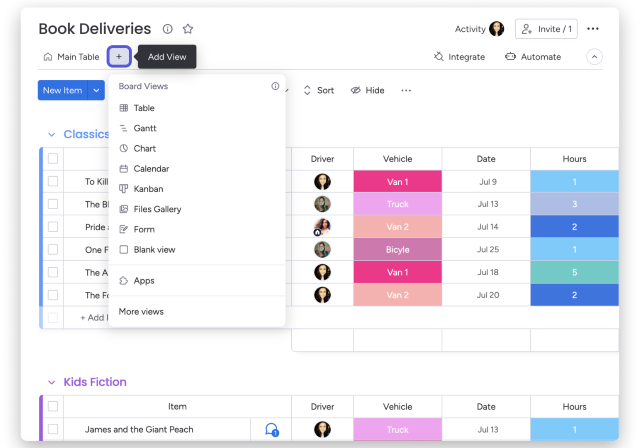
Common types of data visualizations in project management
Some of the most common types of visuals used in project management include:
Yet project scopes can become more dense and complex. When this happens, teams use a variety of visual tools to help tell stories, plan deliverables, and track timeline progress.
These include:
- Complex charts
- Workload views
- Calendar views
- Simple graphs
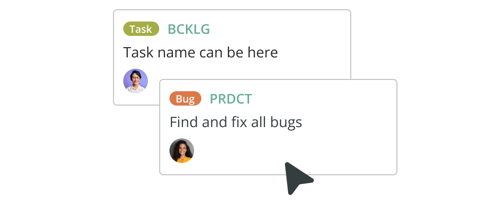
- Cards views
- Table views
- Bar graphs
- Files views
- Bar charts
- Pie charts
Depending on your data visualization tool, you can choose or add your view style. Then, the software will generate a custom data representation for you:
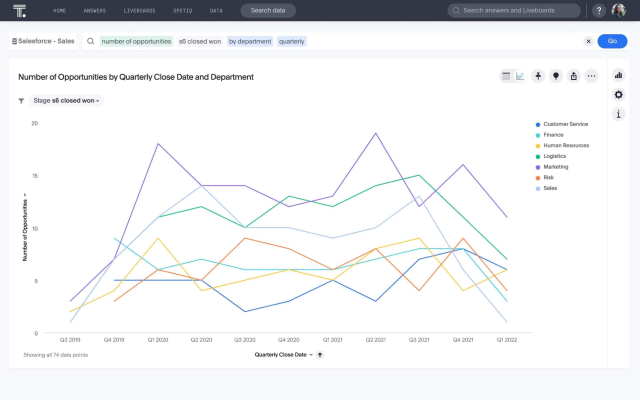
How data visualization improves project management performance
There are many ways data visualization improves project management. Here are three common examples.
1. Gain project clarity
In project management, data visualization has emerged as a game-changer. It influences project performance in a big way. The human brain processes visual information more effectively than it does with raw data, making data visualization a powerful tool for better understanding and decision-making.
Clarity is paramount in project management. That’s where tools like SAP Analytics Cloud come into play. They enable companies to transform complex datasets into interactive visual stories with ease.
These tools help track project milestones, resource allocation, and budgetary trends in real-time. Moreover, they’re fostering transparency and informed choices.
The true potential of data visualization can only be visible when accuracy is upheld.
Inaccurate or misleading data can lead to misguided decisions and compromised project outcomes. Properly configuring the SAP Analytics Cloud will reflect precise information.
Enter expert SAP consulting solutions. These consultants ensure proper data source integration with accurate design visualization models. Also, the insights drawn are meaningful and reliable.
2. Time tracking
Modern-day project management teams are using employee apps for internal communication. This helps them to ensure projects stay on track. Moreover, they use time trackers to measure resource capacity levels. Additionally, they can log time spent on individual project tasks.
Some of these apps also come with enhanced data visuals. This helps Project Management System (PMS) users streamline time-tracking management. They can also see an overview of lunch hours and shift changes. Delegating resources is yet another benefit.
 (
(TL;DR: Various view styles offer various perks. Calendar views and card views allow project managers to track resource availability. They can also measure the entire project team’s bandwidth. Which further allows them to ensure equal shift and task distribution.
3. A holistic view of stakeholders
What’s the purpose of data visualization? It makes information understandable and easy to read but also improves stakeholder management.
Project management teams use data visualization to identify new opportunities and insights. These might not be visible when examining the data from a single source. Yet, with the right tools, it’s possible to do so.
Have you ever thought of what you can get when integrating data from many sources through a CDP? What if you visualize it on a single platform? Project management teams can get comprehensive and holistic views of customers and stakeholders. This task would be impossible with standard dashboards and reports.
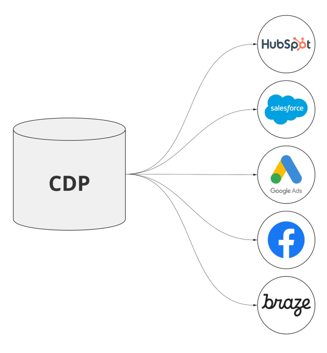
CDPs can boost clarity and help teams manage responsibilities across stakeholders. They can also help mitigate risks like scope creep and project cost overruns.
3 data visualization examples in project management
Data visualization applies to all project management-based industries. Here are three concrete examples:
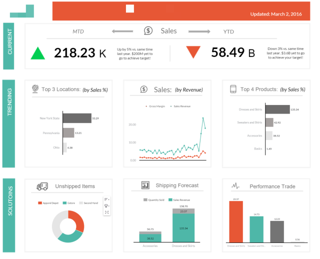
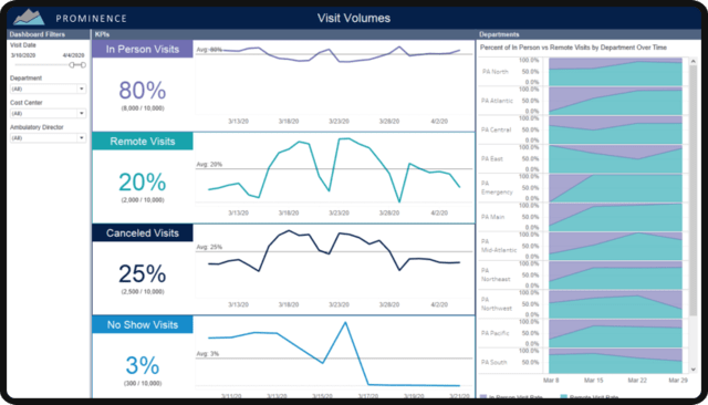
1. Managing fleet delivery
In the realm of logistics, seamless resource coordination is paramount. Electronic Logging Devices (ELDs) have emerged as invaluable tools. These devices ensure compliance with regulations by automating hours-of-service tracking. Also, they contribute to the broader field of project management through data visualization.
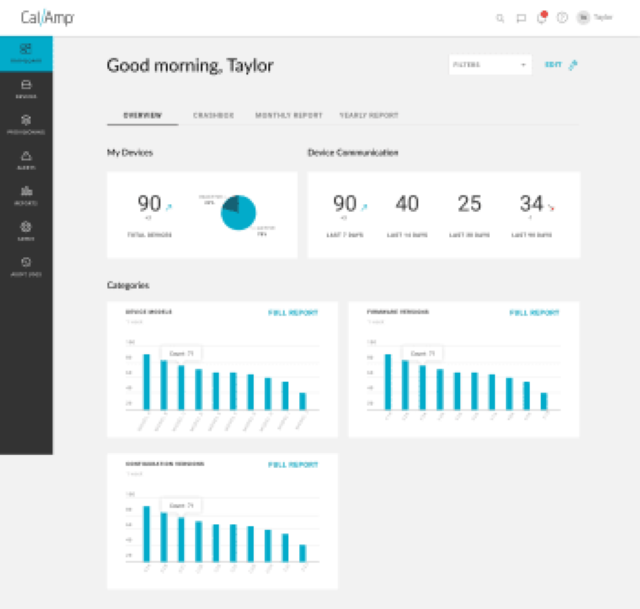
(Image Source)
ELDs capture real-time data on vehicle locations, routes taken, and fuel consumption. When integrated into a comprehensive data visualization system, this information transforms into:
- dynamic maps,
- interactive dashboards,
- and insightful charts.
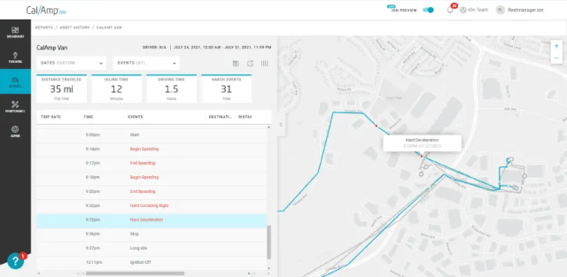
Project managers can visualize vehicle progress, identify bottlenecks, and optimize routes. This leads to efficient resource allocation and timely deliveries. Because of that, ELDs play a dual role:
- They simplify regulatory adherence
- and enrich project management strategies with meaningful visual insights.
2. Healthcare industry
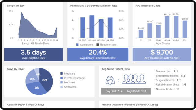
In the healthcare industry, visualization has a significant impact on project management. It plays a huge role in efficient patient flow. Patient flow effectiveness is critical for providing timely care and improving patient outcomes.
Patient flow systems help optimize and visualize patients’ movements through different hospital departments. The data visualization system can present parameters like:
- admission and readmission rates,
- average treatment costs,
- and many other valuable data.
It’s particularly useful in emergency departments. These departments need fast and efficient patient flow. This will ensure that the patients get the best and most timely care possible.
This flow diagram showcases all interactions with each healthcare provider. It also shows waiting times, average costs, and other useful details.
When a patient arrives at the ER, the data flow will visualize their movements through:
- triage,
- diagnostic testing,
- treatment,
- eventual discharge,
- or admission to the hospital.
This visual data flow system usually includes data such as:
- decision points,
- timelines,
- roles of different healthcare professionals,
- any others.
All this affects the patient’s journey. Yet, it’s helpful to visualize the entire patient data flow each step of the way.
Data visualization in healthcare is beneficial. It helps improve the project management performance with:
- Visualization: Visual map plays a huge part. It allows hospital administrators and staff to see each patient’s journey. The information will help them streamline it. This will make the process easier, faster, and more convenient for both parties.
- Optimization: Helps streamline processes, reducing wait times and improving patient care. If the diagram shows that diagnostic testing is a bottleneck, no worries. The hospital can divide more resources into that area. This would help speed up the whole process.
- Data-Driven Decisions: Supports data-driven decisions to enhance operational efficiency. By analyzing the data, hospitals can identify trends and make informed decisions. These decisions include process improvements, deciding on resource allocation, and staffing.
Electronic Health Records (EHRs) and Length of Stay (LOS) are pretty helpful. They can help hospitals get valuable information on administrative and financial activities.
Patient data flow can enhance the patient’s experience. Yet, it allows hospitals to be more effective in treating more patients. Thus increasing their capacity and revenue.
3. Creating a construction risk management plan
Data visualization also plays a crucial role in construction risk management plans.
Always leverage the power of visual representation. By doing so, construction project management teams can identify potential scope creep. Besides, they’ll learn from past construction project data.
Visualizing data allows construction teams several advantages. They can spot patterns, trends, and anomalies indicating risks and potential issues. With this valuable insight, teams can address and mitigate risks. This will help construction projects stay on track and within budget.
One more thing. Data visualization can help with presenting learning opportunities. You’ll understand better from successes, failures, and lessons learned from previous projects. Data visualization is crucial. It allows teams to communicate critical takeaways and best practices. This will help improve future project outcomes.
How to keep data visualizations safe
Having access to data tools comes with an entire host of benefits. Working with project data can create cybersecurity risks and contribute to information silos.
Information silos refer to isolated pockets of data or information. These pockets are locked to specific departments, teams, or individuals within an organization. When information isn’t shared across different parts of the organization, it will lead to:
- potential duplication of efforts,
- a lack of collaboration,
- and inefficiency.
Information silos can hinder the flow of information and impede decision-making processes. That’s why limiting important insights to a few might be a better solution. Allowing the entire organization to use them can cause safety or accessibility issues.
Breaking down information silos is crucial. It will assist in promoting communication, collaboration, and knowledge sharing within an organization. This will lead to improved efficiency and better decision-making.
Ensuring the teams have access to robust data means the potential for more data leaks.
That’s why it’s essential to secure your data visualizations and user access.
Here are two ways to work with data in a safe manner and prevent project information silos:
Secure data visualizations with cloud backup
Companies seek more advanced tools to improve their ability to visualize data. Yet, many have turned to services like AWS or Amazon Quicksight. These services are very popular for interactive visualizations. This tool has revolutionized the way many companies approach project management. It offers unprecedented clarity on critical metrics.
Data dependence is on the rise, so it’s essential to ensure its protection and security. Data backup and recovery solutions are critical for this.
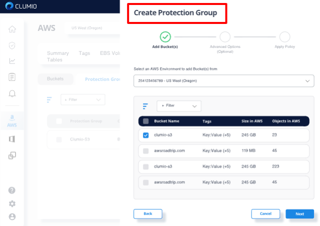
A backup option like AWS is an excellent choice. It guarantees that project data will remain safe and accessible. This is true even if various challenges or unforeseen events arise.
Use authentication protocols
Nowadays, project teams are turning to authentication protocols. These help team members access important platforms and apps safely and securely.
Some project teams may need to use different authentication protocols. By doing so, they can access data from different sources, such as OIDC. These protocols have different advantages and disadvantages depending on the use case. Project managers must know of them when determining who needs access to project data.
With the right authorization protocols set, team members can do a lot. One thing they can do is log in to cloud-based project planning tools. Yet, they won’t have to sacrifice company data or personal data.
Final thoughts
Data visualization plays a pivotal role in enhancing project management. Leveraging the power of visual representation has its perks. It allows project managers to gain valuable insights, identify trends, and track progress.
Data visualizations support clear communication and understanding of project metrics, timelines, and goals while fostering collaboration and alignment among team members. From dynamic charts and graphs to interactive dashboards and Gantt charts—you name it—data visualization transforms complex data into digestible and actionable information.
Project managers can make informed decisions, mitigate risks, and drive successful project outcomes. All they need is comprehension and improved visibility.
TL;DR: Embrace the power of data visualization in your project management strategies. It will unlock new levels of efficiency and success.
Are you ready to witness the power of data visualization?
PS: Need to create stunning visualizations to help your project team thrive? Explore our data visualization features today.
Author bio

Ryan Robinson. I’m a blogger, podcaster, and (recovering) side project addict who teaches 500,000 monthly readers how to start a blog and grow a profitable side business at ryrob.com.
About Author