Wireframes are basic layouts that detail a page’s goals, navigation, and structural elements. They’re meant to make you focus on the foundations of a page before moving on to design choices.
It’s a common mistake to try to incorporate design into wireframes, but when you do this, you make it difficult for viewers to assess your layouts objectively. Something that impresses the viewer visually might not actually do the best job at executing the goals of the page.
Visuals and wireframes should never overlap. Going into too much detail too quickly in the process creates problems for all involved.
Wireframes are not about visuals
Wireframes should convey information, not style. Colors, fonts, and other visual choices aren’t needed at this juncture. Instead, keep your intention set on creating a blueprint that guides the design.
Your priority should be on page flow and functionality. Ask yourself questions like:
- What information is most important?
- How will users navigate between areas?
- What kind of story does your page tell?
- Do areas of the page create questions or concerns for the user?
- Is it clear what the user is supposed to do on a page?
- Is it easy for users to find sections they need?
With wireframes, the goal is to create a seamless user experience that guides users towards informed, appropriate decisions. At this stage, we’re assessing how well each page matches user needs with business goals.
Choosing minimalist representations for your layouts helps all viewers focus on these questions. Adding a design isn’t just unnecessary work; it’s actually a distraction.
Wireframes are rarely about branding
The brand always matters. However, it takes a back seat to functionality at this stage.
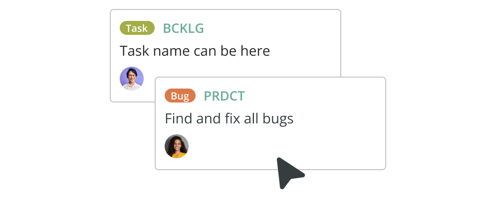
The only occasions where you might consider certain branding points is if a particular brand has a highly stylized and specific user experience. For most, the closest you should come to branding in a wireframe is your content. Working with real content is always a plus when wireframing, even if it’s just a first draft.
Although you may already have some of the images you’ll eventually use, don’t place them on the page. Use a notation to convey placement, the same as you would with any other element.
Rushing the creative process does not benefit your end product. Keep the process moving at a deliberate, steady pace. Branding will soon become a huge component. Right now, it doesn’t need to be your team’s concern.
Wireframes are never about colors
If your wireframe goes beyond two tones, consider reducing your palette. Color, like visuals, creates distractions and will rarely, if ever, need to come into your design. That means excluding even the slightest of gradations.
Monochrome is your best option in 99.99% of all wireframing. It keeps everyone focused on the goals of the page. If you’re worried it looks plain and technical, that’s excellent. You’re doing it right.
Colors shift your perspective. Some components become more emphasized by a splash of red. Meanwhile, a key conversion point easily gets overlooked. Nothing should stand out visually, so everything can stand out structurally.
At some point, your team will need a full-color design. However, it should come after your structure is firmly in place. There’s no use in designing something that fails to support itself structurally.
Types of wireframes (and when to use them)
By now, you may be wondering, ‘When is the right time to add visuals to wireframes?’ Wireframing is a layered process that enables you to produce a highly functional design before adding images and branding. At each stage, your wireframe designs become more detailed and user-ready. You may end up with several wireframe versions over the course of a project, but the three main types are as follows:
- Low-fidelity wireframes: At this stage, the design is a low-detail paper or digital sketch drawn by hand. The boxes and elements are all crude placeholders meant for brainstorming purposes only.
- Medium-fidelity wireframes: At this stage, you’ve worked out many of the placement details and want a more presentable mock-up. Designers use diagramming tools to create a clean, monochrome wireframe they can easily edit after each round of feedback.
- High-fidelity wireframes: At this stage, the wireframe is a highly detailed prototype and often contains real content. The design is close to finished and undergoing final edits.
Low- and medium-fidelity designs happen early in the conceptual process, so they shouldn’t contain visuals. On the other hand, a high-fidelity design is a few steps from being finalized.
You will likely use a pared-down, monochrome aesthetic on your first high-fidelity wireframes as well. But once you lock in all the structural details of the design, it makes sense to test out color, branding, and images in a high-fidelity wireframe to make sure these elements work together. Now that you’ve already assessed the website’s functionality, it’s easier to make effective decisions about the visuals.
Maintain focus
Creating a visually detailed wireframe is alluring, especially if you’re creative. More details allow you to flesh out in-depth ideas you have for the project. They also help bring the user experience to life for the viewer. And in some cases, a project does indeed call for them, but never as a first step.
Unfortunately, introducing visuals too soon in your workflow will end up causing more harm than good. Rather than focusing on creating a page that functions properly and meets its goals, people end up debating and revising elements that never even make it into the final design. Give your team too much to consider at once, and different iterations of your original design will quickly get out of hand and over budget.
Focus on one layer of the project at a time. Don’t waste energy and time fully designing a wireframe when simple shapes and a monochromatic color scale do a better job at communicating your intent.
For a successful wireframe, always remember:
- Avoid any elaborate illustrations,
- Prioritize your page order, and
- Emphasize site copy over UX.
In doing so, you do what’s best for the project and yourself. Your team won’t stress over designing elements that get nixed. Meanwhile, you can focus on building a highly functional page before design steps in to make it beautiful.
Non-detailed wireframes: a win-win idea.
Searching for the right diagramming tool?
Check out Cacoo, a cloud-based diagramming tool for team collaboration.
This post was originally published on October 4, 2017, and updated most recently on December 22, 2021.
About Author

Cacoo Staff
Guest authorCacoo by Nulab is the collaborative diagramming software for modern teams. Use it for project diagrams, workflow planning, brainstorming, online whiteboarding, presentations, and more to keep your team on the same page.