From radiation and falling rocks to icy roads and hungry sharks — when you need someone to understand something in a hurry, only a picture will do. While only slightly less dramatic, the business world employs diagrams for that very same reason: simplicity.
This is because the brain processes images 6,000 times faster than text, which makes them something of a secret weapon when you need to share information in a way people understand. But what is a diagram in the business world, exactly? Allow us to explain.
Different types of diagrams
Diagrams help us simplify complex data, visualize abstract concepts, and plan detailed projects while bypassing pages upon pages of text. They come in a variety of formats, each best suited to conveying specific types of information.
Or in other words — to get the most out of your diagram, you need to choose the right one for the job. So — what do you want to do?
I want to map out my ideas
To kick off brainstorming sessions and organize ideas or thoughts, you’ll want the following:
- Mind Map
- Lotus blossom diagram
I want to visualize hierarchical or structural information
These diagrams are ideal for representing organizational structures, taxonomies, and other hierarchical or branching relationships.
- Organizational chart
- Tree Diagram or dendrogram
- Pyramid or triangle chart
I want to illustrate a process or sequence
If you’re looking to depict decision pathways, steps in a process, or the sequence of events, these diagrams have got your back.
- Flowchart
- Feedback loop
- Decision tree
- Roadmap
- Gantt chart
- Fishbone diagram
I want to analyze and prioritize
For prioritization, strategic analyses, or comparisons (e.g. brand comparisons), these diagrams can be effective.
- Matrix or quadrant chart
- Venn diagram
- SWOT analysis diagram
- Perceptual diagram (aka positioning map)
I want to visualize proportional or distributional data
When you need to depict proportions or distributions, these diagrams come in pretty handy:
- Circle diagram (pie chart, doughnut chart)
- Stacked bar chart
I want to describe user or customer experiences
To map user experiences or illustrate a conversion processes, consider the following:
- Funnel chart
- Journey map
There are myriad other diagrams beyond these, but the above are the most commonly used and understood business diagrams you’ll encounter in the workplace.
How to choose the right diagram for your needs: A step-by-step guide
With so many options, how do you make the right choice? It starts by taking a close look at what you’re trying to accomplish.
Let’s unpack some key considerations.
Understand your purpose
The first step is getting crystal clear on your purpose. What are you trying to achieve with this diagram? Are you mapping out a process, brainstorming ideas, analyzing data, or illustrating relationships? Different diagrams have distinct strengths, so start by identifying your main goal.
Consider your audience
Next, keep your audience in mind. Who will be viewing this diagram? Is it for a team of engineers, executives, or perhaps customers? What’s their level of familiarity with the subject matter? What kind of visual language will they best respond to?
Knowing your audience will guide you in choosing a diagram that is functional, but also user-friendly and engaging.
Identify the complexity of information
The level of detail in your information should also be a guiding star. If you’re dealing with a complex process with many steps or variables, a flowchart or a decision tree could be useful. If you need to show hierarchical relationships, then a tree diagram or an organizational chart might be your best bet.
Think about the diagram’s scalability
Don’t forget to consider the scalability of your diagram. If your data or process is expected to evolve over time, will the diagram adapt well to these changes? Some diagrams are easier to modify than others, so it’s important to consider future updates when selecting the right diagram.
You’ll also want to think about the format here — paper and pen/whiteboards are great for quick diagrams, but if this is something you need to keep, share, and/or modify over time, you’ll want an online diagramming tool.
Reflect on aesthetics
And last, but certainly not least, consider looks. A visually pleasing diagram can make all the difference when it comes to engagement and comprehension. While this shouldn’t be your primary criterion, choosing a diagram type that can be made visually appealing (while still effectively communicating the information) is a good shout.
18 types of diagrams (and how to use them)
Here’s a bumper list of the most popular diagrams, with tips on how to make and use them.
Mind map
The starting point of great ideas, mind maps are a fantastic tool for brainstorming and organizing thoughts. They offer a creative way to capture your thinking process and provide a springboard for creativity.
What is a mind map?
A mind map is a visual representation of hierarchical information that starts with a central idea, with related concepts branching out like the limbs of a tree. It uses color, imagery, and spatial arrangement to provide context and improve memory retention. The radial structure allows for a broad exploration of thoughts and their interconnections.
When to use a mind map
Mind maps are incredibly versatile. They are commonly used in the early stages of projects or tasks, where brainstorming and ideation are key. Here are a few scenarios where a mind map can come in handy:
- Brainstorming: They can help stimulate free association and generate a multitude of ideas.
- Planning: They’re excellent for structuring your thoughts and planning projects, articles, presentations, etc.
- Problem-solving: They can help visualize the problem and possible solutions.
- Note-taking: They can capture the key points of a lecture or meeting in a structured manner.
- Learning and revision: They can simplify complex topics, making it easier to understand and remember.
Lotus blossom map
The lotus blossom map is a method for structured brainstorming, allowing a deeper dive into each idea with each layer of ‘petals’. It nurtures creativity by encouraging the exploration of related concepts and insights.
What is a lotus blossom map?
A lotus blossom map is a graphical tool used to explore the extensions of a central theme or challenge. Imagine a grid where the center box holds the main idea, surrounded by eight boxes, each representing a related concept. Each of these secondary ideas can further blossom into eight more ideas, forming the petals of the ‘lotus.’
When to use a lotus blossom map
This diagram is ideal when you need an expansive view of an idea or challenge. Here are some circumstances where the lotus blossom map might be your best bet:
- Idea expansion: It encourages users to delve deeper into sub-ideas and explore possible avenues.
- Product development: Useful for identifying potential features or improvements.
- Solution finding: When faced with a challenge, it can provide multiple solutions by branching out.
- Concept teaching: In education, it aids in breaking down a topic into its core components and related subtopics.
- Brainstorming: When a mind map feels too broad, the lotus blossom offers a more structured approach.
Matrix or quadrant chart
Matrix or quadrant charts are compelling tools in the professional world, particularly when it comes to strategic decision-making and data analysis. Let’s demystify what they are and how you can put them to work.
What is a matrix or quadrant chart?
A matrix or quadrant chart is a two-dimensional diagram divided into four quadrants, typically using two axes to represent two dimensions. Each quadrant represents a different outcome or category. Data points or items are plotted within this chart based on their values along the two axes. This chart type effectively enables a quick comparative view of multiple dimensions.
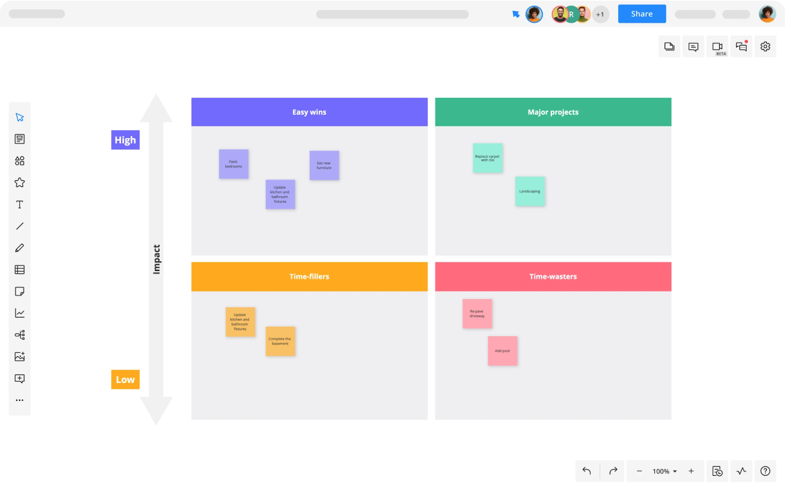
When to use a matrix or quadrant chart
A matrix chart is a versatile tool, making it a favorite among business strategists, project managers, and data analysts. Here’s where it comes in useful:
- Strategic analysis: They’re commonly used for SWOT analysis (Strengths, Weaknesses, Opportunities, and Threats) or for prioritizing initiatives based on impact and feasibility.
- Risk assessment: They can help visualize risk vs. reward scenarios, categorizing items based on their level of risk and potential return.
- Project management: They’re often used to prioritize tasks based on urgency and importance, a concept famously known as the Eisenhower Matrix.
- Product management: They can be used for stakeholder analysis or for categorizing features based on user value and development effort.
Venn diagram
Venn diagrams have been a staple in our educational and professional lives, helping us visually dissect the relationships between different groups of items.
What is a Venn diagram?
A Venn diagram uses overlapping circles or other shapes to illustrate the logical relationships between two or more sets of items. Each circle represents a set, and the area where the circles overlap represents commonality between the sets. Essentially, Venn diagrams are a visually appealing way of showing how much different groups have in common, and how they differ.
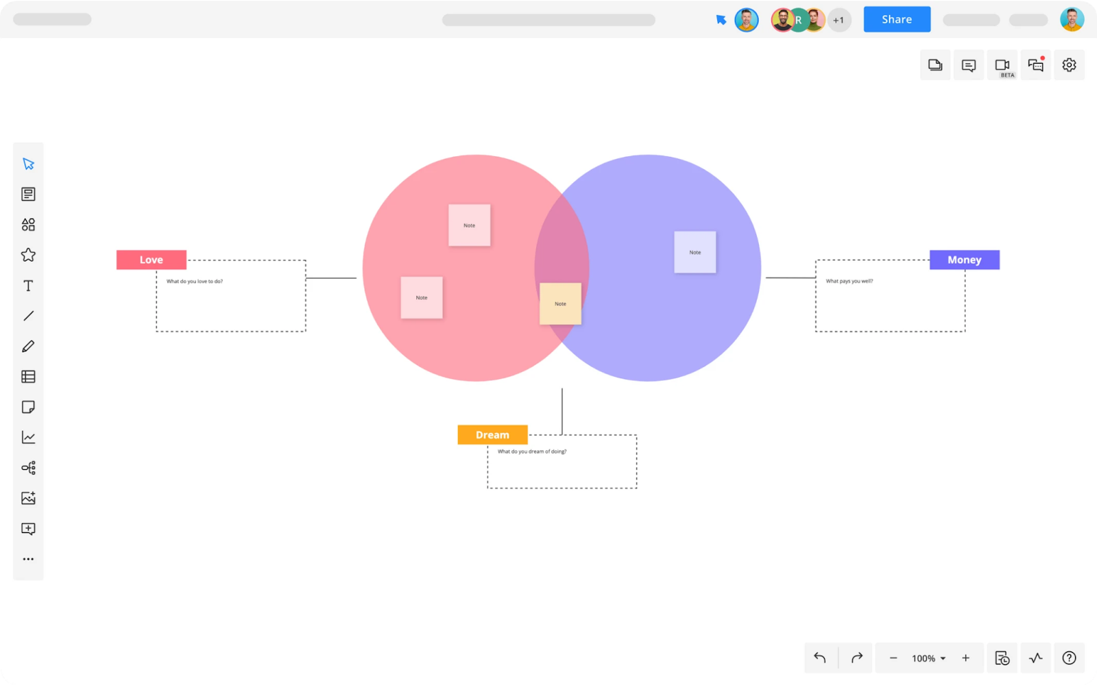
When to use a Venn diagram
The uses of Venn diagrams are varied and many:
- Comparisons and contrasts: Venn diagrams shine when it comes to comparing and contrasting different sets. They visualize shared and unique characteristics of items or ideas.
- Logical relationships: They’re excellent for visualizing intersections between different sets, such as shared traits in a population.
- Problem solving: They’re useful in logical problem solving, by clearly illustrating overlap between different elements or categories.
- Data classification: They can be used to visually classify data into various categories and identify their intersections.
Circle diagram
When it comes to showcasing proportionality and distribution, few diagrams are as intuitive and universally understood as the circle diagram.
What is a circle diagram?
A circle diagram, often referred to as a pie chart or doughnut chart, is a type of diagram that represents data in a circular format, with slices of the circle illustrating different categories. The size of each slice is proportional to the quantity it represents from the whole.
When to use a circle diagram
A circle diagram’s strength lies in its simplicity and its ability to present proportional or percentage data effectively.
- Budget breakdown: They’re great for visualizing how a total budget is divided among different departments or expenditures.
- Market share: They can illustrate the distribution of market share among competitors.
- Survey results: They’re handy for showing the distribution of responses to a multiple-choice survey question.
- Demographic data: They can represent different segments of a population.
Stacked bar chart
A champion of comparative analysis, stacked bar charts efficiently represent parts of a whole over different categories. They provide an immediate visual comparison between individual subgroups and the overall scenario.
What is a stacked bar chart?
A stacked bar chart is a variant of the bar chart where segments of different categories are stacked over one another. This structure allows for an individual category’s size comparison and the collective totals, offering a two-dimensional assessment.
When to use a stacked bar chart
Stacked bar charts shine in situations where it’s crucial to understand the composition and cumulative effect:
- Market segmentation: Understanding different product sales across various regions.
- Budget analysis: Comparing expenditures across departments, with breakdowns for each category.
- Time series analysis: Observing how different segments evolve over time.
- Survey results: Displaying answers from multiple-choice questions to view overall trends.
- Performance metrics: Evaluating various components contributing to the total performance.
Tree diagram or dendrogram
For visualizing hierarchical or branching information, tree diagrams or dendrograms provide an organized, intuitive layout. Let’s take a deeper look:
What is a tree diagram or dendrogram?
A tree diagram, also known as a dendrogram, is a diagram that displays hierarchical relationships in a tree-like structure. The diagram starts with a single node, which then branches off into two or more nodes, each of which may further branch off, and so forth. Each branch represents a possible outcome or decision.
When to use a tree diagram or dendrogram
Tree diagrams are incredibly versatile and can be used in many scenarios where hierarchical or sequential data is involved:
- Decision making: They can be used to map out various potential outcomes of a decision, helping in decision analysis.
- Project planning: They can be used to break down a project into smaller, manageable tasks, making them great for project management.
- Hierarchy display: They’re excellent for showing hierarchical relationships, such as in organizational charts or website structures.
- Probability analysis: They can be used in statistics to graphically represent different outcomes and their probabilities.
Pyramid or triangle chart
The pyramid or triangle chart, a go-to for demonstrating hierarchical structures or processes that build upon each stage, is up next on our exploration of diagrams.
What is a pyramid or triangle chart?
A pyramid or triangle chart is a type of diagram that uses a triangular structure to represent data. It is typically divided into horizontal sections, each representing a different level of the hierarchy or stage of a process. The width of each section represents its level’s size or importance, with the widest at the base and the narrowest at the top.
When to use a pyramid or triangle chart?
Pyramid charts are an excellent tool for visually displaying information that naturally forms a hierarchy or has a progression. Here are a few situations where pyramid charts can shine:
- Hierarchical data: They effectively illustrate hierarchical structures, such as management levels in an organization.
- Progressive processes: They’re great for visualizing processes that progress in stages, such as Maslow’s hierarchy of needs or stages of consumer decision-making.
- Population data: In demographics, they’re used to display the distribution of various age groups in a population (population pyramid).
- Energy transfer: In sciences, they can represent energy flow or transfer in an ecosystem (energy pyramid).
Funnel chart
If you’re dealing with stages in a process that narrow down from a large initial group to a smaller final one, a funnel chart is an especially effective tool.
What is a funnel chart?
A funnel chart is a type of diagram that represents stages in a process where the quantity decreases over time, much like a physical funnel. Each stage is represented by a horizontal bar, and the width of the bar corresponds to the quantity or percentage at that stage.
When to use a funnel chart
Funnel charts are excellent for displaying conversion rates across multiple stages in a process. Here are a few situations where funnel charts are typically used:
- Sales and marketing funnel: A funnel chart is perfect for visualizing the sales or marketing process, from initial lead generation to final sale, showing potential customers’ drop-off points in the process.
- Conversion analysis: Funnel charts are commonly used in web analytics to visualize the conversion funnel, helping to identify where users exit the conversion process.
- Lead qualification: They can illustrate the stages of a sales process from prospecting to closing a deal.
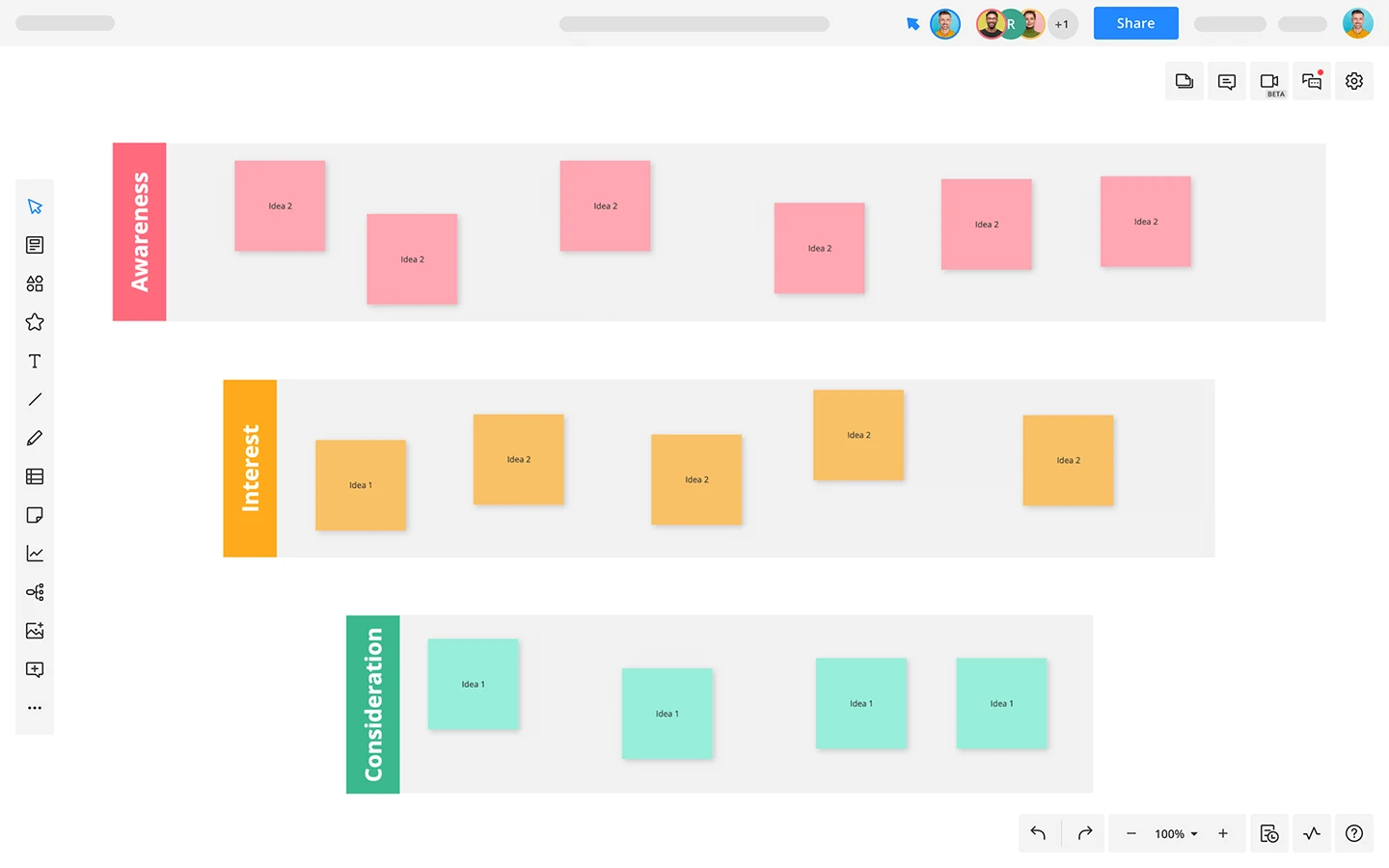
Journey map
When looking to understand and enhance the customer experience, there’s no better tool than a journey map. By offering a visual narrative of the customer’s experience, a journey map helps you get into the shoes of your users.
What is a journey map?
A journey map, aka a customer journey map, is a visual representation of a user’s experience with a product or service over time and across different channels or touchpoints. It provides a narrative of a user’s interaction from their perspective, mapping out their needs, perceptions, and emotions at each stage of their journey.
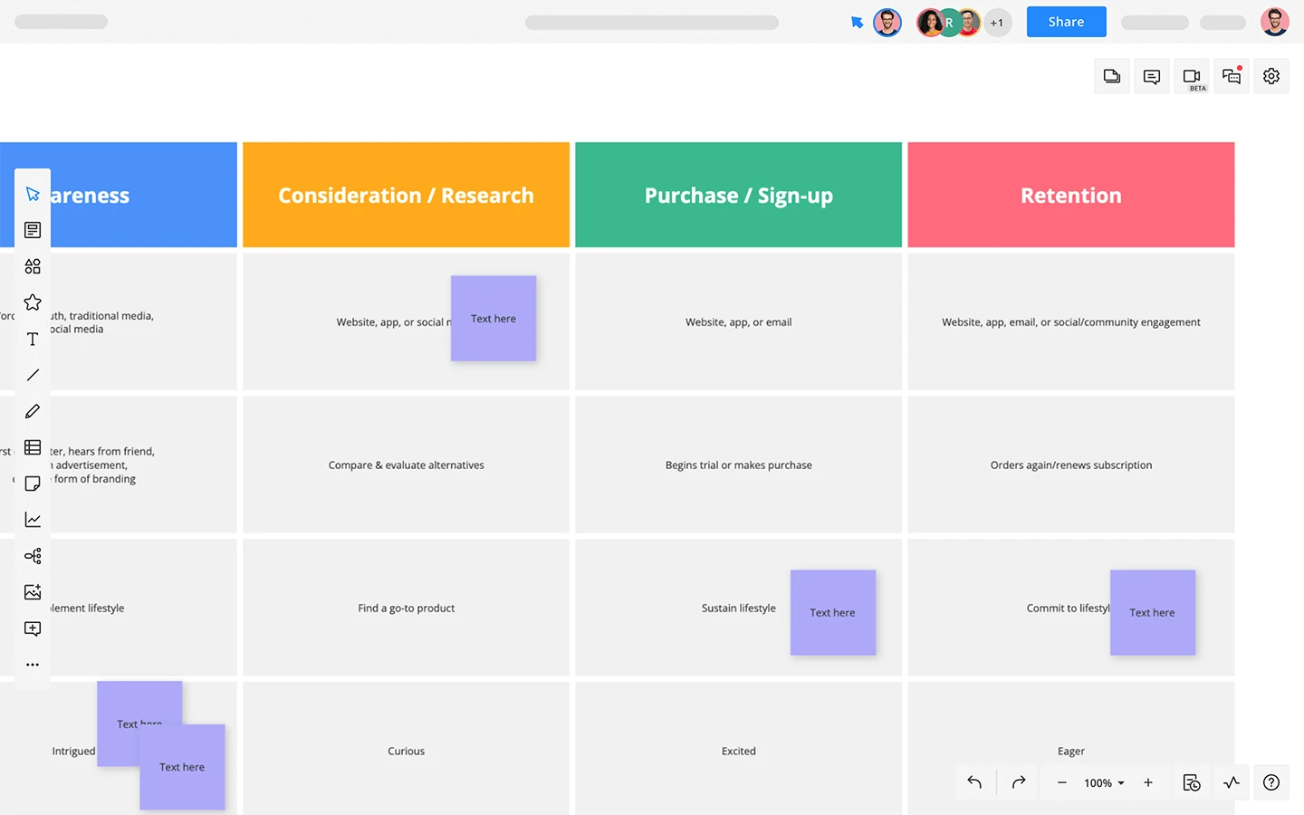
When to use a journey map?
Journey maps are essential tools in user experience (UX) and service design:
- Customer experience understanding: A journey map helps to understand a customer’s experience by visualizing their interactions with a product or service, capturing their feelings, motivations, and questions for each touchpoint.
- Service design: Journey maps are used to identify customer needs and pain points, highlighting opportunities to improve the service.
- Product development: They provide insights into how a product or service can be enhanced to better meet user needs and expectations.
Roadmap
Whether you’re looking at strategic planning or defining the direction of a product, roadmaps serve as an invaluable tool. By providing a high-level view of the goal and the major steps or milestones needed to get there, roadmaps align teams and stakeholders toward a common vision.
What is a roadmap?
A roadmap is a strategic plan that outlines a goal or desired outcome and includes the major steps or milestones needed to reach it. It is often visual and timeline-based, which helps communicate not just the ‘what’ but also the ‘when’ behind what you’re building.
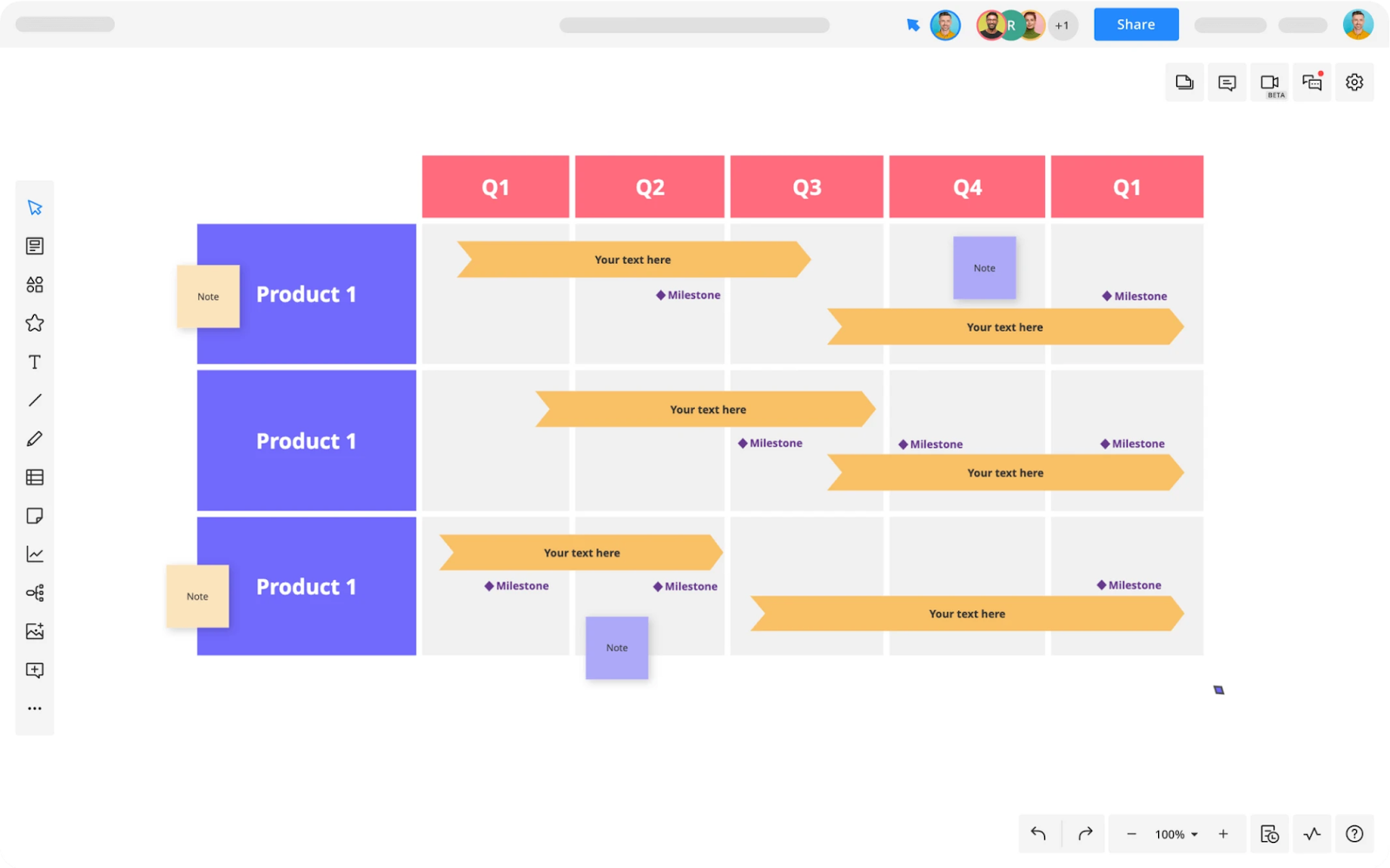
When to use a roadmap?
Roadmaps are excellent tools for high-level strategic planning and communication:
- Strategic planning: Roadmaps effectively communicate the strategic vision, outlining the key initiatives that drive towards the organization’s goals.
- Product development: Product roadmaps help plan and communicate the direction and progress of product development over time.
- Project prioritization: They assist in project prioritization, offering a clear picture of what projects or features are in the pipeline and how they align with the broader strategy.
Gantt chart
Gantt charts are a staple tool in project management. They provide a clear visual representation of a project schedule, allowing for easy planning and tracking of tasks and milestones.
What is a Gantt chart?
A Gantt chart is a type of bar chart that represents a project schedule. It displays tasks along a timeline, showing the start and finish dates of the various components of a project. Dependencies between tasks are represented by arrows.
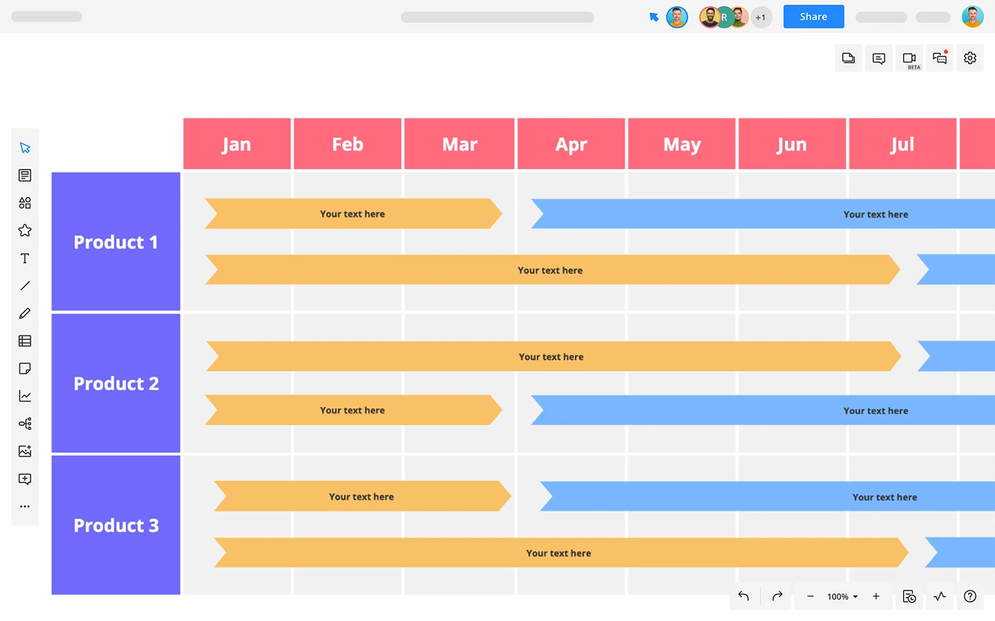
When to use a Gantt chart
Gantt charts are excellent tools for detailed project scheduling and management:
- Project planning: A Gantt chart helps in project planning by breaking down the project into tasks, assigning durations to them, and setting the sequence in which they should be completed
- Project scheduling: It provides a clear visual schedule of the project, making it easier to understand and communicate the plan
- Task dependencies: Gantt charts are also useful in identifying and illustrating task dependencies, the relationships between different tasks that dictate the order of operations
- Project tracking: They allow project managers to track the progress against the plan, making it easier to identify if a project is running on schedule or falling behind.
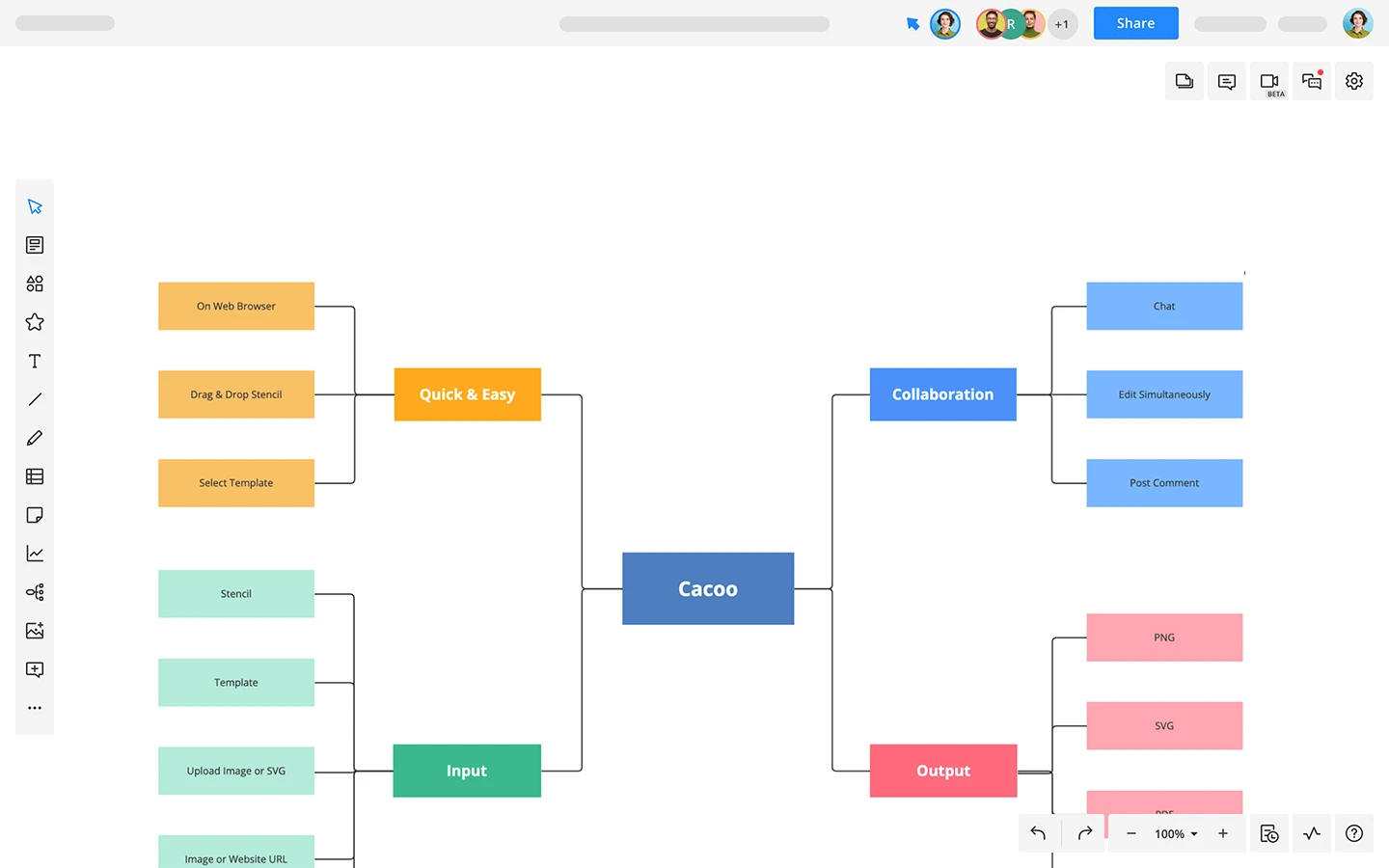
Flowchart
Flowcharts are one of the most versatile and widely-used tools. They map out the sequence of steps in a process, making complex procedures easy to understand and follow.
What is a flowchart?
A flowchart is a type of diagram that represents a workflow or process. It displays the steps as boxes of various kinds, and their order of execution is indicated by arrows connecting the boxes.
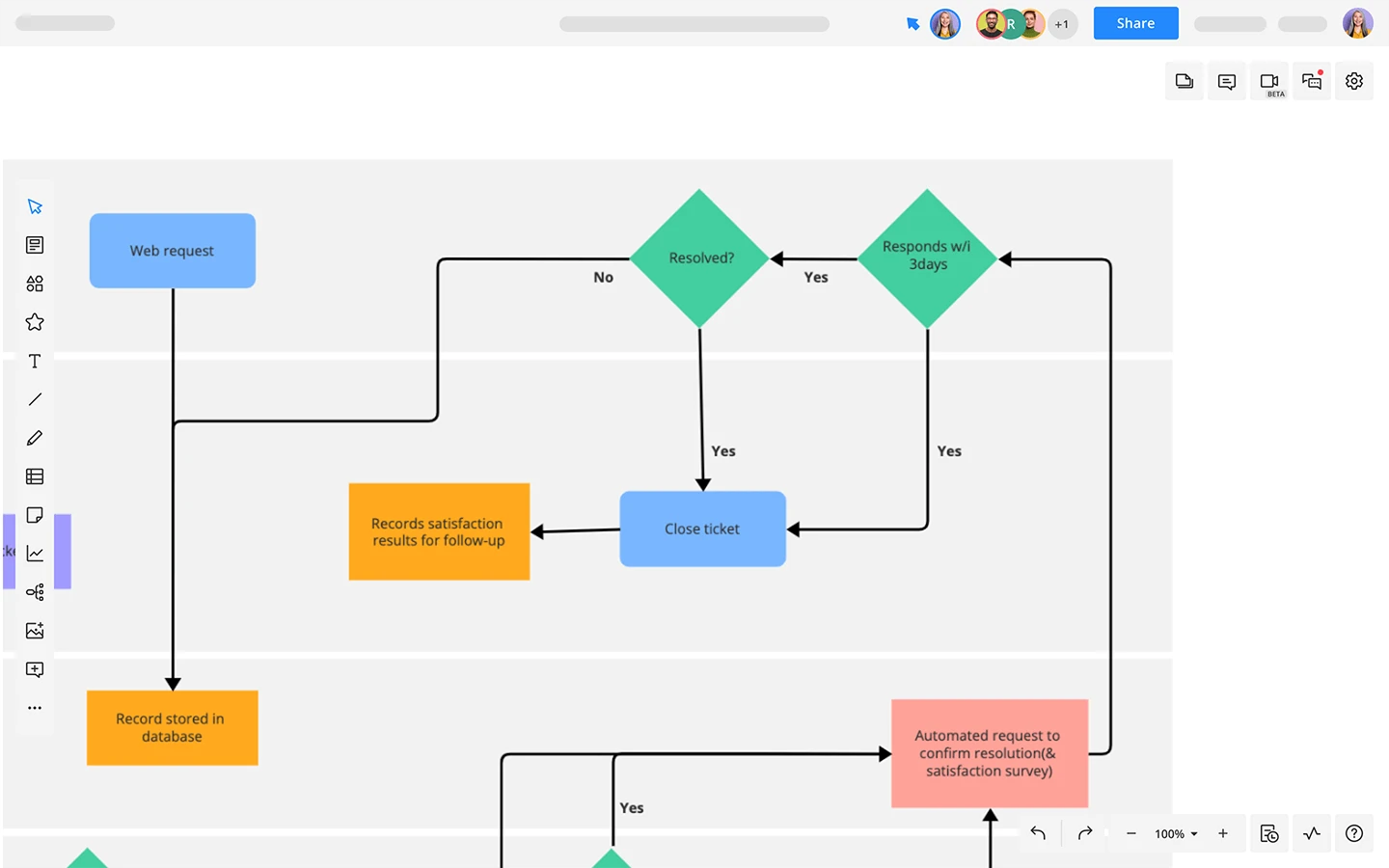
A flowchart created via one of Cacoo’s many flowchart templates
When to use a flowchart
Flowcharts are perfect for situations where you need to map out and analyze the steps in a process:
- Process understanding: A flowchart is an excellent tool to visualize a process or workflow in its entirety, making it easier to understand and follow.
- Process documentation: Flowcharts can serve as effective documentation of processes, useful in training materials or manuals.
- Problem-solving: They help in identifying bottlenecks or inefficiencies in a process, aiding problem-solving and process improvement efforts.
- Decision making: Some flowcharts, known as decision trees, can be used to guide decision-making processes, indicating different outcomes based on different decisions.
Feedback loop
When it comes to understanding and improving systems or behaviors, feedback loops are heavy hitters. They reveal the consequences of actions, providing an opportunity for adjustment and improvement.
What is a feedback loop?
In systems theory, a feedback loop is a process where the outputs of a system are circled back and used as inputs. It shows how a change in one direction leads to further change in the same or opposite direction. Feedback loops can be either positive, where the output amplifies the system, or negative, where the output dampens the system to maintain equilibrium. They often take a flowchart-like appearance, with boxes and arrows showing the movement of items.
When to use a feedback loop
Feedback loops are widely used in various fields, including:
- System analysis: In system dynamics and modeling, feedback loops help understand how different elements of a system interact and affect each other.
- Behavioral changes: They are used in psychology to understand how feedback influences behavior and to encourage desirable behaviors.
- Business management: Businesses use feedback loops for continuous improvement, analyzing customer feedback and adjusting products, services, or processes accordingly.
- Climate science: In climate science, feedback loops explain how changes to the environment can lead to further changes, such as the melting of polar ice leading to more heat absorption and further warming.
Decision tree
Decision trees give you a graphical representation of possible outcomes and paths, enabling structured and informed decision-making.
What is a decision tree?
A decision tree is a flowchart-like diagram that shows the various outcomes from a series of decisions. It can be used to visually represent a decision problem, helping to identify the strategy most likely to reach a goal.
When to use a decision tree?
Decision trees are perfect for situations where you need to weigh complex options and outcomes:
- Decision-making: They can help visualize and navigate through complex decision-making scenarios, showcasing potential outcomes and the path to each.
- Risk assessment: Decision trees are effective in evaluating the potential risks and rewards of decisions, useful in fields like investment and project management.
- Data analysis: In machine learning and data mining, decision trees are used as a predictive model which maps observations about an item to conclusions about the item’s target value.
Fishbone diagram
When it comes to problem-solving and root cause analysis, Fishbone diagrams, also known as Ishikawa or Cause-and-Effect diagrams, are your BFF. They help teams to identify, explore, and visually display the potential causes of a specific problem or quality issue.
What is a fishbone diagram?
A fishbone diagram is a visual tool used to identify and present the possible root of a particular problem. Its structure resembles the skeleton of a fish (hence the name) with the ‘ribs’ representing potential causes, which are grouped into categories.
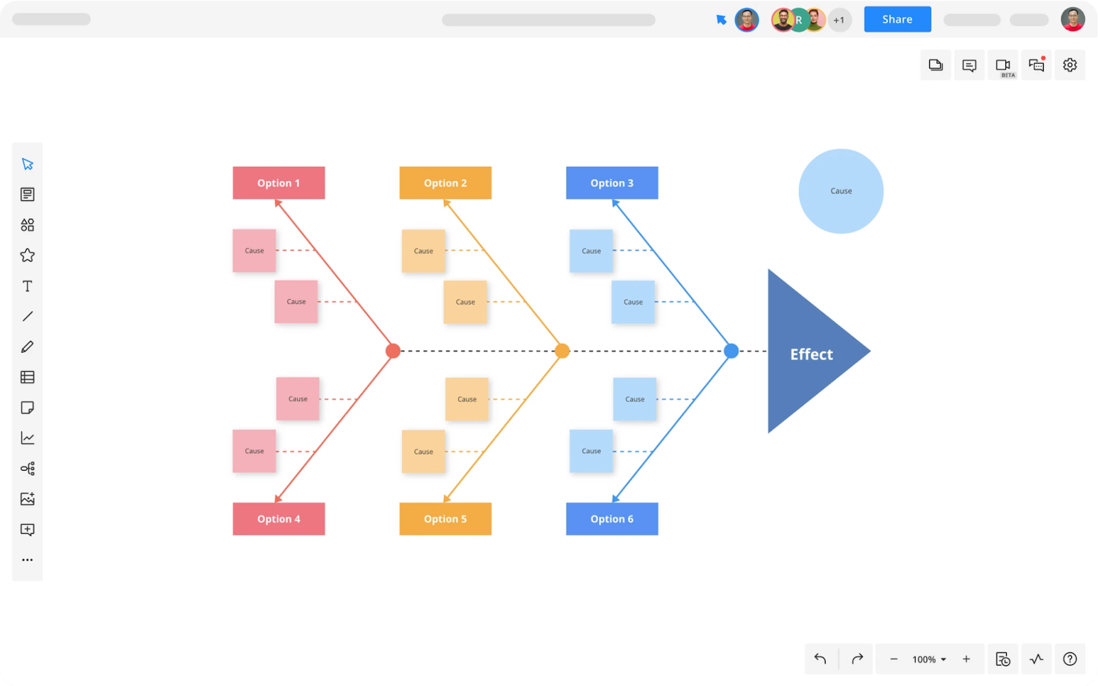
When to use a fishbone diagram?
Fishbone diagrams come in handy when you need to dig deep into a problem:
- Problem-solving: They are used in troubleshooting sessions to identify the root cause of a problem. This helps you focus on the cause and not just treating the symptoms.
- Quality control: In the field of quality management, fishbone diagrams help you identify potential factors causing an overall effect in systems and processes.
- Process improvement: They aid in process improvement by helping to identify the elements of a process that can be enhanced or changed.
Organizational chart
Organizational charts illustrate the roles and an organization’s hierarchy, giving employees a clear understanding of their position within the broader context.
What is an organizational chart?
An organizational chart, also known as an org chart or organogram, is a diagram that displays the structure of an organization and the relationships and relative ranks of its parts and positions. It gives an illustrative overview of the organization’s management levels and divisions.
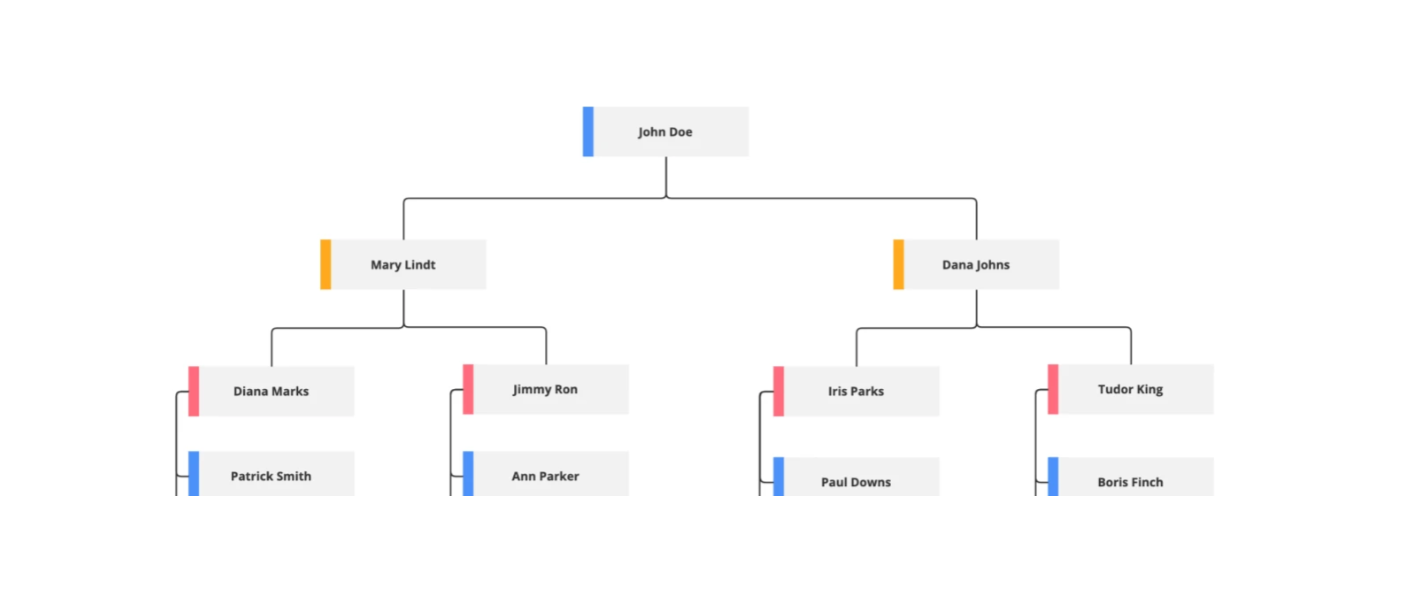
An org chart template in Cacoo
When to use an organizational chart?
Organizational charts are primarily used for:
- Understanding organizational structure: An org chart can quickly provide a snapshot of the organization’s structure, making it easier to understand the various roles and departments within the organization.
- Onboarding and training: They are used for onboarding and training materials to help new employees understand the organizational hierarchy and their role within it.
- Planning and reorganizing: Organizational charts are useful for planning personnel changes and organizational restructuring.
- Communication: They facilitate better communication by providing clarity on who reports to whom and who is responsible for what areas.
SWOT analysis diagram
SWOT analysis diagrams offer a structured way to evaluate an organization’s Strengths, Weaknesses, Opportunities, and Threats — hence the acronym!
What is a SWOT analysis diagram?
A SWOT analysis diagram is a matrix used to identify and analyze the internal and external factors that can impact the viability of a project, product, place or person. It’s composed of four quadrants, each dedicated to one element: Strengths, Weaknesses, Opportunities, and Threats.
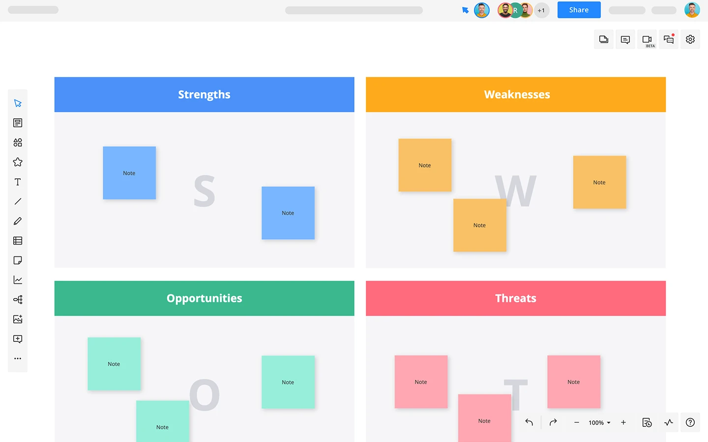
When to use a SWOT analysis diagram
A SWOT analysis diagram is useful in numerous scenarios:
- Strategic planning: It provides a structured way to evaluate the internal and external factors that influence strategic goals and initiatives.
- Business decisions: It’s an effective tool for making business decisions, helping you weigh different aspects and see the bigger picture.
- Problem-solving: It assists in identifying the various factors contributing to a problem and in mapping out potential solutions.
- Product development: It guides product development by identifying the strengths to leverage, weaknesses to address, opportunities to pursue, and threats to mitigate.
Perceptual (positioning) map
A strategic tool in every marketing team’s arsenal, perceptual maps visually represent how consumers view brands or products in the market. They capture the essence of brand positioning and competition in a two-dimensional space.
What is a perceptual (positioning) map?
A perceptual map plots brands or products based on two dimensions, typically representing attributes or feelings consumers associate with them. By plotting brands on this map, companies can identify gaps in the market, potential niches, or how their brand is perceived compared to competitors.
When to use a perceptual (positioning) map
This tool is particularly crucial for market analysis and strategy development. Some of its applications include:
- Competitive analysis: Understand where your brand stands in comparison to rivals.
- Market gap identification: Spotting opportunities for new products or repositioning.
- Brand strategy: Crafting narratives or campaigns based on how you want to position or reposition your brand.
- Consumer insights: Gauging how shifts in consumer preferences or perceptions impact the market landscape.
- Product development: Guiding product features based on desired market positioning.
Why use diagrams?
Diagrams are more than just doodles on a page; they’re your secret weapon when it comes to communicating ideas. Here’s why you should make them your go-to tools.
Breaking down the complex
Diagrams have a knack for turning the complex into the comprehensible. A well-crafted diagram is like a good translator — it takes a difficult concept and expresses it in a language we can all understand. That’s why we see diagrams across all kinds of fields, from education to business to engineering, breaking down big ideas into digestible visual pieces.
Seeing the connections
Diagrams are the pros of showing relationships and structures. Want to understand how roles in a company interlink? An organizational chart has your back. Need to follow a process step-by-step? Flowcharts are your guides. Trying to identify cause-and-effect relationships? Fishbone Diagrams can be your detectives. With diagrams, the interconnections are right there for you to see.
Making decisions and solving problems
Diagrams aren’t just about understanding; they’re also about action. They’re the toolkit for decision-making and problem-solving, helping you spot patterns, uncover potential solutions, and weigh up risks. When you’re facing a tough choice, a Decision Tree can show you the way. When you’re sizing up a business venture, a SWOT analysis diagram can help you assess the field. When there’s a problem to be solved, a Fishbone Diagram can help you get to the root of it.
Boosting memory
Remember studying for exams? A good diagram can often make the difference between a ‘fuzzy concept’ and a ‘clear idea.’ When you turn information into a visual format, it sticks. It’s easier to recall, making diagrams great buddies for studying, planning, and presenting.
Powering up communication and collaboration
Finally, let’s not forget that diagrams are communication superheroes. They provide a shared visual language that teams can rally around. They ensure everyone’s on the same wavelength and serve as a handy reference point for discussions, brainstorming sessions, or project collaborations.
What’s in a diagram? diagram anatomy
Diagrams can seem complex at first glance. They’re intricate and layered, filled with different components that all work together.
Frame
A key component of any diagram is the frame. This gives you the structure, serving as the container for the rest of the elements; a little like how the skeleton forms the structure to the human body. The frame could take many forms: a circle, a grid, a pyramid, or a box, depending on the type of diagram you’re working with. It’s the blueprint that guides the placement and arrangement of the rest of the components.
Lines
Lines play a pivotal role in diagrams. They connect the various parts of the diagram, acting as the pathways that guide the eye and the mind. Lines can represent different types of relationships or sequences, and the style of the line (solid, dashed, dotted) and direction of any arrows can communicate even more detail about the nature of these relationships.
Labels
Labels give context and clarity. They’re the words, phrases, or sentences that add detail and meaning to the diagram. They help to identify what each symbol or shape represents and can provide additional information or explanations. Labels can be found within shapes, along lines, or even outside the main frame of the diagram.
Shapes or symbols
Shapes and symbols are the visual representation of the information or data. They’re the icons that stand in for different elements, ideas, or steps within the diagram. Shapes and symbols can be simple geometric forms or more complex icons, and their meaning can vary widely depending on the type of diagram.
Colors
Colors, though not always necessary, can greatly enhance a diagram. They can be used to distinguish between different elements, highlight important points, or convey additional information. Used strategically, colors can make a diagram more visually appealing and easier to understand.
Why diagramming tools are your secret weapon
Ever tried assembling a piece of furniture without the right tools? It can be quite the challenge, right? The same can be said when creating a diagram.
Yes, you can sketch a diagram on a piece of paper, but the process can become laborious and less effective when the complexity increases. This is where diagramming tools come into the picture, and we’d argue that they’re your secret weapon for crafting clear, compelling diagrams. Here’s why:
Streamlined design process
Diagramming tools provide an easy-to-use, intuitive interface that allows you to create and edit diagrams swiftly. They come with drag-and-drop functionality and a library of shapes, symbols, and templates that you can use to construct your diagram. This saves you time and makes the design process smooth and efficient.
Consistent and professional appearance
The beauty of a diagramming tool is that it gives your diagrams a consistent and professional appearance. The standard shapes, lines, and text elements ensure uniformity across all of your creations. This can be particularly useful if you’re creating diagrams for business or academic purposes where the presentation matters as much as the information.
Easy editing and updating
Imagine having to erase and redraw portions of a hand-drawn diagram every time there’s an update or change. Not fun, right? With diagramming tools, making changes is as simple as a few clicks. You can add, remove, or adjust elements without disturbing the rest of your creation.
Collaboration made easy
Many modern diagramming tools offer collaborative features. This means you and your team can work together on the same diagram, no matter where you are. Everyone can contribute, make edits, and leave comments in real-time. This streamlines the teamwork process, making it easier to gather input and reach a final version.
Easy to share and present
Once you’ve finished your diagram, diagramming tools allow you to share your work effortlessly. You can export your diagram in various formats (like PDF or PNG), embed it on a webpage, or even present it directly from the tool. This means your work can easily be included in reports, presentations, or shared directly with stakeholders.
Scalability and complexity management
As your information becomes more complex, a diagramming tool can keep up. These tools are designed to handle anything from a simple Venn diagram to a complex process flow or organizational chart. They allow you to manage the complexity without losing the clarity.
A good diagramming tool doesn’t just help you create diagrams; it allows for a more effective and efficient design process, promotes collaboration, and ensures your final product is clear, professional, and impactful. Now that sounds like a secret weapon worth having, doesn’t it?
About Author

Georgina Guthrie
Guest authorGeorgina is a displaced Brit currently working in France as a freelance copywriter. Before moving to sunnier climates, she worked as a B2B agency writer in Bristol, England, which is also where she was born. In her spare time, she enjoys old films and cooking (badly).

![[Flowchart] What New Year’s resolution should you make?](https://cdn.nulab.com/learn-wp/app/uploads/2021/01/14211608/new-years-resolution-blog-cacoo-2021.png)
![[Flowchart] A holiday gift guide: flowchart style](https://cdn.nulab.com/learn-wp/app/uploads/2018/12/14210321/Gift-Guide-blog-image2-680x450-1.png)